What museums can learn from architect Tadao Ando’s Clark expansion

- Share via
The art press these days is rife with stories about splashy museum building projects: from the controversial expansion of the Museum of Modern Art in New York (which has devoured a relatively new building by Tod Williams Billie Tsien architects) to the behemoth cinder blob proposed by Swiss architect Peter Zumthor for the Los Angeles County Museum of Art.
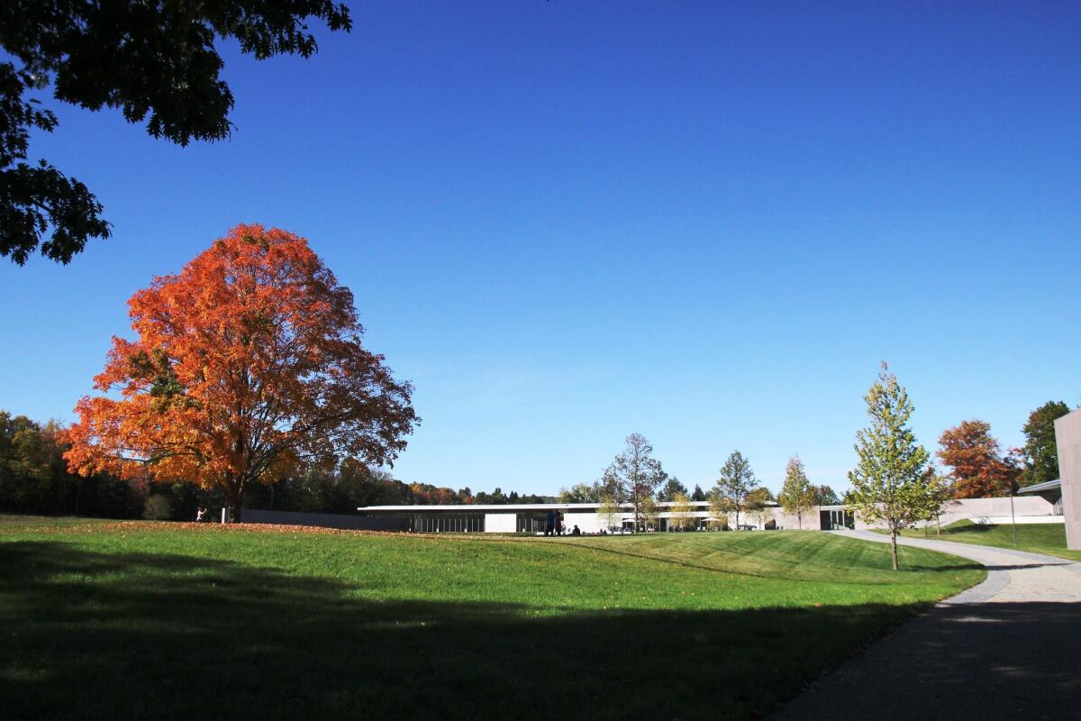
Which is why the expansion at the Clark Art Institute in Williamstown, Mass., unveiled this last summer, is so remarkable. Low-key and restrained, it avoids showy asymmetric geometry or structures that resemble bathtubs. With the assistance of prominent architects, including Pritzker Prize-winner Tadao Ando, the museum has added a number of earth-hugging structures and conducted thoughtful expansions, adding more than 75,000 square feet of space (galleries, a cafe, a gift shop, conservation studios, education areas and more) without doing anything that comes off as brash.
This is a big deal. After paying a visit to the Clark last week, I’m hoping this bucolic little museum might serve as a template for other institutions who might confuse bigger with better.
But let’s start with the specs: The Clark is situated among 140 acres of rolling New England hillsides, of the postcard-perfect sort you might find on a 5,000-piece jigsaw puzzle. Previously, its art collection -- strong on French impressionist and 19th century academic painting -- was shown primarily in a 43,000-square-foot neoclassical building designed by Daniel Deverell Perry in the 1950s. Some exhibitions spilled into the institute’s separate research center building, which was opened in 1973.
The current revamp brings a dose of the contemporary to this New England grand dame. (And she is definitely a grand dame, of the snooty Continental sort.) This included a careful reconsideration of the entire sprawling campus. Landscape architect Gary Hilderbrand reworked hiking trails and created a series of tiered reflecting pools that help infuse the visitor experience with a remarkable serenity. Architect Annabelle Selldorf refreshed the interiors of Perry’s 1955 Museum Building, maintaining the Victorian proportions while updating the space with new lighting systems and reconfigured rooms.
And, of course, there are the additions by Ando, who has designed other American museums, including the Modern in Fort Worth and the Pulitzer Arts Foundation in St. Louis. To the Clark, Ando has added the 42,600-square-foot Clark Center, which has galleries, a cafe and gift shop, and now greets institute visitors. He also designed the Lunder Center at Stone Hill, a two-story, 32,000-square-foot structure that houses galleries and a conservation center, among other programming.
Ando’s simple, modern structures dig deep rather than reach high, tucked in the hillsides, with roof lines that hover just over the landscape. The material of choice is raw, poured concrete (one of Ando’s signature materials), giving the whole place an earthy bunker feel. The Clark Center, guarded by stone walls at the entrance, is encased by glass on the back side, which makes for a big reveal of the undulating Berkshires the moment you step in.
From the Clark Center, a diagonal wall, made, in parts, of red granite, reaches out toward the old Museum Building, ending just steps from its front door -- a terrific juxtaposition of old and new.
Certainly, the building has its weirdnesses: visitors are greeted by the gift shop in the lobby (aren’t we supposed to exit through the gift shop?) and the diagonal wall that runs through the main Clark Center structure leaves some of the new galleries sporting some odd polygonal shapes.
But, overall, as a museum experience, I can’t complain. The whole setting is so placid and Ando’s architecture plays so magisterially to this quality, that it almost physically discourages the visitor from doing something as ridiculous as checking a Tweet on a cellphone. In other words: This is an experience that is designed for the contemplation of art.
Glad to see the Clark got that part so right.
The Clark Art Institute has several temporary exhibitions currently on view: “Radical Words: From the Magna Carta to the Constitution” (through Nov. 2), “Make It New: Abstract Painting From the National Gallery of Art” (through Oct. 13) and “Raw Color: The Circles of David Smith” (through Oct. 19), at 225 South St., Williamstown, Mass., clarkart.edu. In addition, the permanent collection is always on view.
Twitter: @cmonstah
More to Read
The biggest entertainment stories
Get our big stories about Hollywood, film, television, music, arts, culture and more right in your inbox as soon as they publish.
You may occasionally receive promotional content from the Los Angeles Times.


