Architecture review: National September 11 Memorial

Reporting from New York — If you were expecting the National September 11 Memorial to turn out to be a visionary or uncompromising monument to human tragedy and architectural destruction, you probably haven’t been paying sustained attention to the process that created it. And who could blame you? The rebuilding effort at the World Trade Center site has been marked by enough grandstanding, backbiting and power grabs, among politicians and designers alike, to push even the most dedicated optimist toward utter cynicism.
At its core, though, the memorial — designed by architect Michael Arad and landscape architect Peter Walker and set to open next month on the 10th anniversary of the 9/11 attacks — has managed to preserve at least a kernel of genuine and affecting meaning.
FOR THE RECORD:
Memorial: An architecture review in the Aug. 12 Calendar of the National September 11 Memorial in New York said that a forthcoming museum at the memorial site was designed by the Norwegian firm Snohetta. The museum’s above-ground portion, known as the Museum Pavilion, is designed by Snohetta, while its underground section is by Davis Brody Bond, now part of Aedas. —
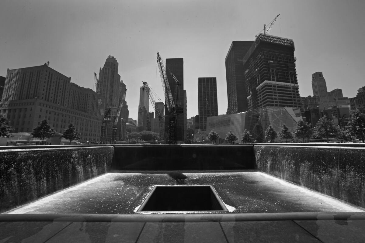
The central idea of Arad’s original design remains intact: to keep the footprints of the twin towers open to the sky as massive, sunken fountains. Approaching either of those voids through the long rows of oak trees that Walker added to the site and encountering the names of the 9/11 victims carved into a dark-bronze parapet along their outer edges, as I did earlier this week, is to be reminded in visceral fashion of the immensity of the events of that day and the sheer scale of what was destroyed.
Photos: ‘Reflecting Absence’: The 9/11 Memorial
Covering 7.5 acres in total, or just less than half of the World Trade Center site’s original 16 acres, the memorial is the first part of the massive, many-headed reconstruction plan for ground zero to be completed. It will be joined next fall by a museum, designed by the Norwegian firm Snohetta, occupying a relative sliver of space between the memorial’s twin voids.
Rising just north of the memorial is the 1 World Trade Center tower, at first designed in a ham-handed collaboration between Daniel Libeskind, the master planner of the overall site plan for ground zero, and architect David Childs of Skidmore, Owings and Merrill, and now credited solely to Childs. (It is scheduled to open in 2013 and rank as the tallest building in the United States.)
Also under construction to the east of the memorial are a skyscraper by Fumihiko Maki — so-called Tower 4 — and Santiago Calatrava’s transportation hub, a sadly compromised symbol of the ground zero planning morass that is now pegged for a 2014 completion. A potential performing arts center by Frank Gehry, meanwhile, has never left the drawing board.
The memorial has its roots in a design that Arad, then an unknown 34-year-old architect, submitted to the 2003 memorial design competition, which drew 5,201 entries in all. Arad’s proposal was as stark as it was simple: those two huge voids, filled with rushing water, sliced into an empty, monumental plaza. It was also remarkable for the disdain it showed for Libeskind’s master plan, which called for the area around the tower footprints to be sunken well below street level. That gesture promised to keep ground zero an open wound even as new skyscrapers rose along its edges.
The leaders of the memorial competition made clear that they would consider only those proposals that respected Libeskind’s master plan. But that meant essentially trying to design a memorial inside a memorial. Arad’s design, determinedly ignoring the competition brief, suggested raising the plaza around the footprints back up to street level.
As the master plan already mandated knitting the site back into the street grid around the site, replacing streets that had been erased by the World Trade Center’s raised superblock in the 1970s, lifting the memorial also allowed it to flow directly into the surrounding neighborhood. Indeed, that single gesture by Arad, made as he rushed to finish his entry in the summer of 2003, may in the end have a larger impact on the urban character of the rebuilt World Trade Center than any other.
After being named one of eight finalists in the memorial competition, Arad was essentially ordered by the jurors — including Maya Lin, designer of the highly acclaimed Vietnam Veterans Memorial in Washington, D.C., and a champion of Arad’s proposal from the start — to bring an experienced landscape architect on board to flesh out and humanize his rather barren scheme. He chose Walker, who is based in Berkeley and known for a crisp, minimal style. At 71, he was at that point more than twice Arad’s age.
The pair’s victory in the competition, in early 2004, was a serious blow to Libeskind’s master plan and its notion of a submerged memorial; combined with the decision by developer Larry Silverstein to take 1 World Trade Center (originally called the Freedom Tower) away from him and hand it to Childs, it essentially left Libeskind as a spectator at the site the general public continues to closely associate with him.
In the seven years since, the design for the memorial has changed markedly. Originally it called for visitors to descend a series of ramps to an area beneath the voids, where they would read the victims’ names while facing a wall of falling water. But the entire lower section was eliminated in 2006, both to eliminate a potential security bottleneck, as members of the public waited to be screened, and to cut the budget of the project, which had ballooned to an estimated $1 billion.
A raft of other changes — some championed by the victims’ families, others by the bureaucrats at the Port Authority of New York and New Jersey, which controls the site, and still others by New York City’s planning department — altered the design of benches, lighting and other details. But by all accounts the process of planning and building it stabilized once New York Mayor Michael Bloomberg assumed control of the memorial foundation, the body raising money to help fund the project, five years ago. The final cost estimate is a still-hefty $700 million.
The completed memorial, which will open to the families of victims in a Sept. 11 ceremony and to the public on Sept. 12, pairs the vast scale and emptiness of the tower footprints with a park-like landscape of 416 swamp white oak trees. That combination reflects the tricky path Arad and Walker have had to walk here, producing both a memorial to destruction and a usable park for a part of Manhattan that has grown increasingly residential since 2001.
The oaks are planted in neat rows running east-west, but seen north-south they dissolve into a less ordered grouping. Walker and Arad have worked to extend the sense of flatness that marks the granite sections into modest grass areas, treating the entire seven-acre plaza as a single, taut plane.
For the first several months, if not longer, all visitors will enter the memorial at a single point, at its southwest corner. A few years from now, once the streets that are being rebuilt along its edges have opened up, it will be accessible from every direction, with the oak trees marching out to the curb or even past it.
After moving through the grove of oaks, which will eventually grow roughly 60 feet tall, creating a thick canopy overhead, visitors will emerge in front of one of the voids. Marked by the same odd marriage of design philosophies that characterized the twin towers — the crisp architecture of minimalism stretched to massive proportions — the voids are gigantic, nearly an acre in size. At the bottom of each one is another, smaller square opening, through which the water from the fountain disappears, as if dropping into an unseen abyss. The names carved into the bronze panels ringing the voids mark not just the ground zero victims but also those who died at the Pentagon, on United Flight 93 and an earlier attack on the World Trade Center in 1993.
The sense of progression in the memorial design that leads from the outer edges of the site through the trees to the voids is equally important in reverse. Once you’ve read the names and confronted the void, you’ll make your way back out toward the cacophony of Manhattan, with the green landscape both giving you time to consider what you’ve just seen and suggesting a sense of growth and rebirth.
Unlike Lin’s devastatingly simple design in Washington, this is far from a brilliant or transformative memorial. It lacks the sharp conceptual power that an artist, rather than an architect, might have brought to the job. Though certain details — the simple, square granite benches, the narrow light poles — are suitably spare and deftly executed, others, particularly the parapets themselves, are overly polished, even handsome, right where they should be most stark.
In retrospect, it seems clear that the memorial competition process unfolded far too quickly, before the nation as a whole had a chance to make sense of the larger meaning of the 9/11 attacks. Arad, alone among the eight memorial finalists, produced a design with a strong conceptual backbone, but he did so only by grabbing and holding tightly to the notion of the tower footprints as the foundation of his entry.
As a result, his design operates both as a pared down, abstract design and as a literal representation of what once covered the site. That was a smart, strategic design move more than a profound or searching one — one that allowed him, essentially, to protect his minimalist bona fides while also playing in a much broader way to an audience expecting to find at the memorial easily legible cues about memory, loss and architectural scale.
And yet for all the ways that it has been buffeted by external forces — and for all the diversity of the public it will have to serve, including mourning relatives, neighborhood residents and visiting tourists decamping from tour buses — the memorial hasn’t been deformed in the way Libeskind’s master plan or the 1 World Trade Center tower have been. It has proved just hardy enough, in the end, to stand its ground.
Photos: ‘Reflecting Absence’: The 9/11 Memorial
christopher.hawthorne@latimes.com
More to Read
The biggest entertainment stories
Get our big stories about Hollywood, film, television, music, arts, culture and more right in your inbox as soon as they publish.
You may occasionally receive promotional content from the Los Angeles Times.


