Coldwater Canyon guesthouse a green-hued retreat in a box
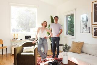
DORRIE AND PAUL MARKOVITS’ nontraditional guesthouse frequently stops traffic. Perched atop Coldwater Canyon, the playful cube-shaped structure resembles a large jack-in-the-box from which a clown might pop at any moment. Clad in tapered, limeade-hued panels, it seems slightly out of character on the quiet street of traditional homes -- including their own, a mid-1950s ranch.
“Neighbors have yet to weigh in on the project,” says Dorrie, a graphic designer who collaborated on the vivid color scheme with Santa Monica architect Aleks Istanbullu. But her 6 1/2 -year-old son, Jeremy, and all his friends, she says, “think it’s ‘super cool.’ ”
The project began three years ago when Paul, a commercial real estate investor, called in Istanbullu.
“I wanted a place apart from the main house to read and listen to music,” says Paul, an amateur photographer and architecture aficionado who admires the work of the Bauhaus period as well as midcentury California modernists Rudolph Schindler and Richard Neutra.
Istanbullu drew up plans for the retreat, located on the highest corner of the property, to take advantage of the site’s dramatic canyon views. But the initial concept of a pure, cube-like space soon gave way to practical considerations. A second structure was added to accommodate a bedroom, bath and kitchen, so the addition could function as a guesthouse as well as a retreat. Istanbullu then joined the two structures by way of a glassed-in walkway.
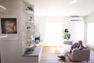
The cube’s living room features a floor-to-ceiling library that holds Paul’s extensive collection of architecture and photography books and magazines as well as a built-in sofa where he can stretch out and read. A cutout corner of the living room sports a mitered-glass window that captures canyon views. A glass floor cantilevers over a lily pond like an elevator stuck between floors.
But it is the imaginative exterior that makes passersby smile and stop to ask, “What is it?” Istanbullu covered the conventional, wood-frame structure with a second skin of fiber cement siding cut into a pattern of tapered panels. The skin stands slightly apart from the main body of the guesthouse, allowing air to flow between the panels and the structure to create a passive air-cooling system. Istanbullu says the double-skin siding minimizes the need for an air conditioner, but the Markovitses added one anyway, using it only on very hot days.
And the vibrant green color scheme? “It went through many incarnations,” says Dorrie, who experimented with a variety of muted palettes, including avocado, sage and Army green, then finally drew inspiration and the nerve to paint brighter hues when Istanbullu handed her a trio of leaves from the backyard’s creeping fig hedge.
“The trick,” she says, “was to get three colors of equal values so one hue didn’t pop out at you -- it was a challenge.”
Istanbullu sees the patterned green shell as symbolizing blades of grass swaying in the wind. “I wanted to make a man-made object evocative of nature,” the architect says. “The looseness of the house . . . the way it feathers away into the landscape comes from my desire to make it part of the outdoors.”
The Markovitses don’t think of it as a typical addition.
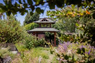
“It’s more an element in the garden,” Dorrie says, “like a fun piece of sculpture that makes us smile.”
More to Read
Sign up for The Wild
We’ll help you find the best places to hike, bike and run, as well as the perfect silent spots for meditation and yoga.
You may occasionally receive promotional content from the Los Angeles Times.


