Wilshire Grand: No detail is too small when you’re delivering a $1.35 billion skyscraper
- Share via
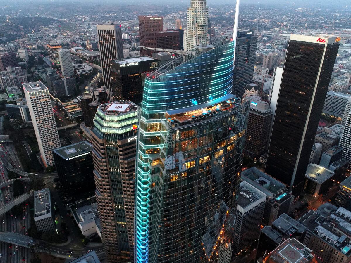
Architect Chris King isn’t entirely sure when Reyner Banham clicked, but the English critic’s theories about Los Angeles came to him at just the right time.
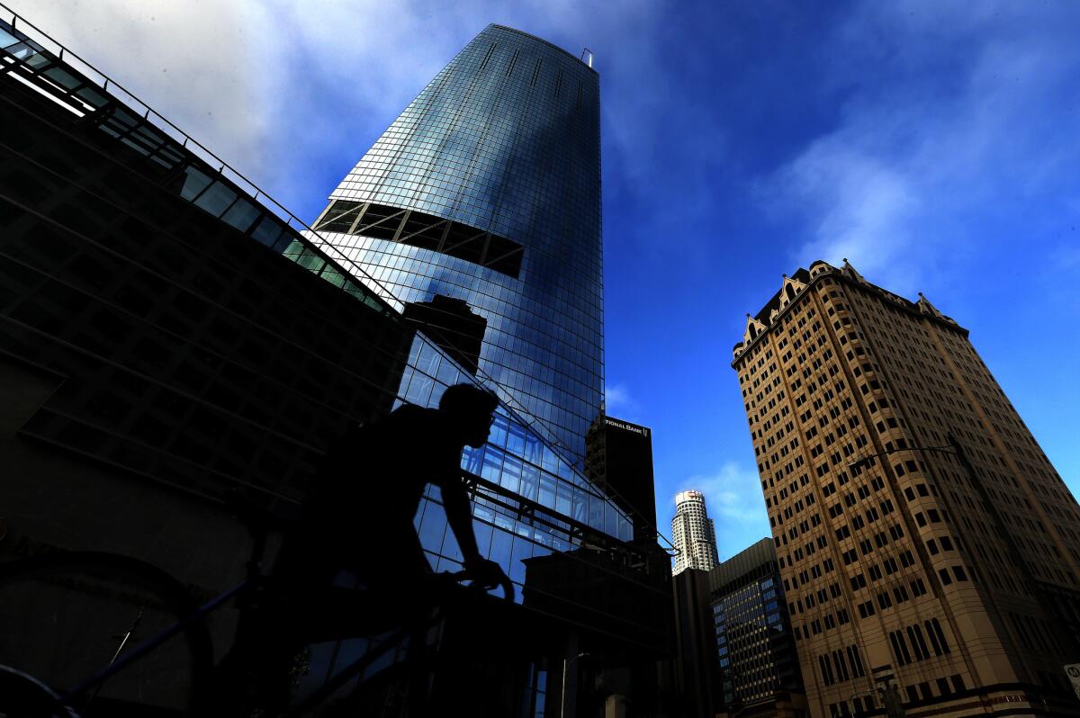
Long before demolition crews moved in on the squat and aged hotel that had occupied the corner of Figueroa Street and Wilshire Boulevard, the 41-year-old architect with A.C. Martin Partners tried to imagine what the interior of the new skyscraper — the Wilshire Grand — might look like.
The canvas was huge, more than 2 million square feet, fitting for the city’s tallest building, a combination of hotel and offices, public and private space.
King and the design team at A.C. Martin had been brainstorming a variety of concepts that would complement the architecture — its indoor-outdoor spaces, its seismic supports, its vantage upon the city — and they needed to strike a look that would mirror Los Angeles’ identity.
Early on they had misjudged, developing a furniture scheme styled after the distinctive Korean roof tiles, giwa. They felt it would appeal to the building’s owner, Yang Ho Cho, the chairman of Hanjin International Corp. and Korean Air.
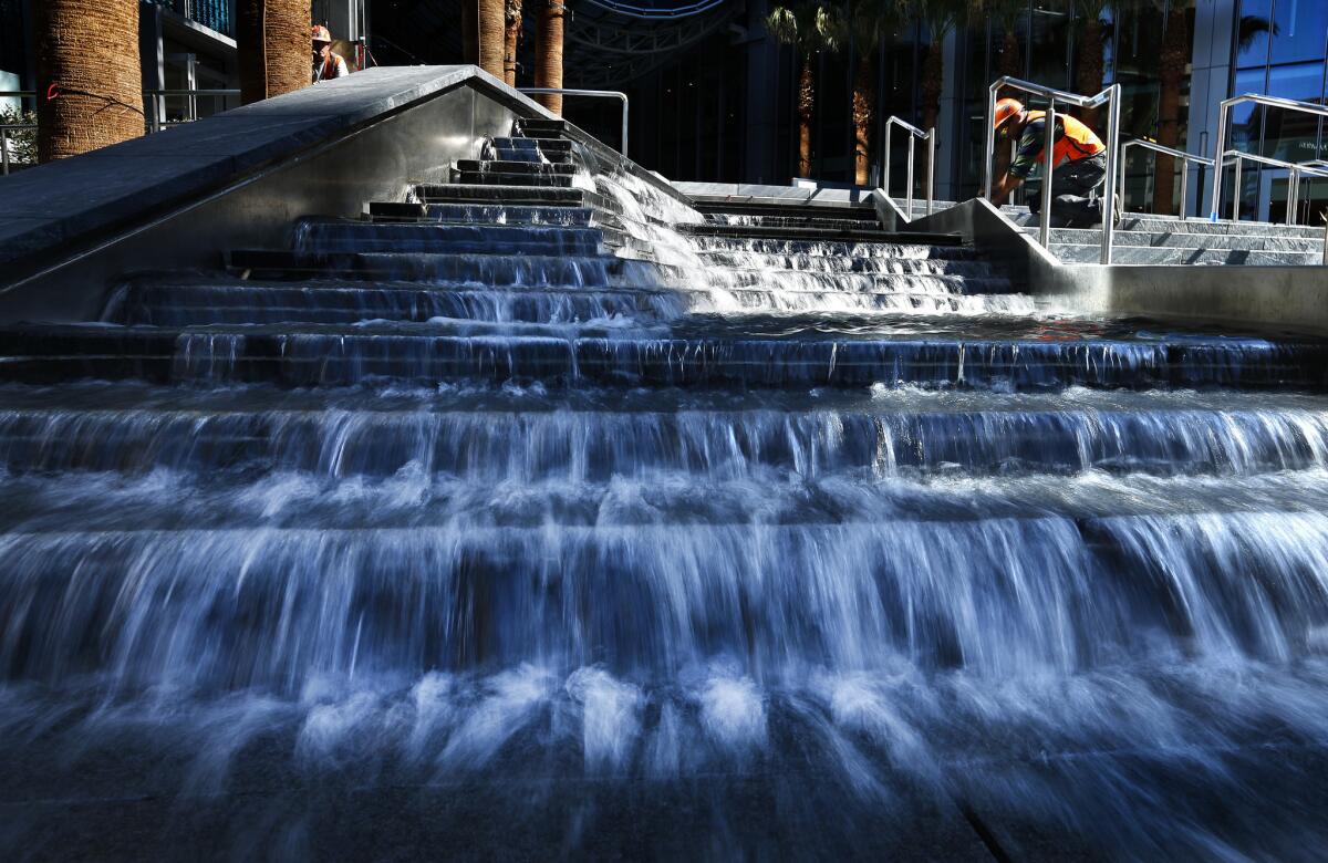
But Cho and his daughter Heather, who had taken a lead in the project, didn’t want the building to reflect Korean culture. Instead, they insisted that it capture Los Angeles’ essential qualities.
What is the big idea, they pressed King.
Accustomed to clients asking about color schemes and materials, King realized that he needed to think larger and more conceptual. The giwa furniture style was too small.
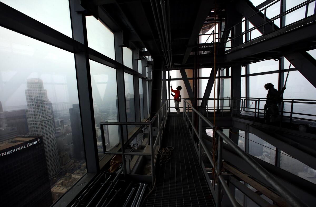
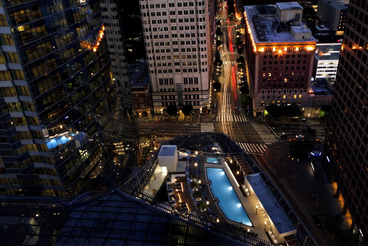
Taking to the street, he studied the building site from neighboring buildings, and as the concrete core began to rise, he took the construction elevator to the top floors, where Los Angeles emerged from the rose of the compass: to the west, the swirl of the 10 and the 110 freeways; to the south, the linear grid of subdivisions stretching to San Pedro; to the east, the downtown skyline, and to the north, the San Gabriel Mountains.
King realized then that Banham still had it right. Each angle corresponded to the four ecologies: Surfurbia, Foothills, The Plains of Id, Autopia. Each would inform to the interior design of the city’s newest building.
::
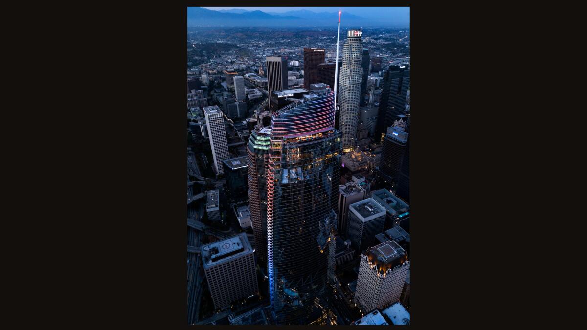
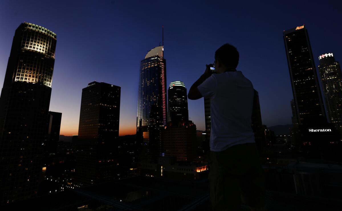
On a recent spring twilight, King was out on a rare evening run in Echo Park. Banham was far from his mind when he caught a glimpse of the Wilshire Grand lit up as it had never been before.
In a riot of color, a vertical band of light — blue fading to yellow like the colors of a sunset — played along the building’s spine, and as the image lit up Instagram and as technicians fine-tuned the LEDs from inside the tower, King felt a kick of adrenaline.
Four years of construction were coming to an end, nearly 10 years conceiving, planning and drawing, and with hotel guests arriving within weeks, he knew that time was running out.
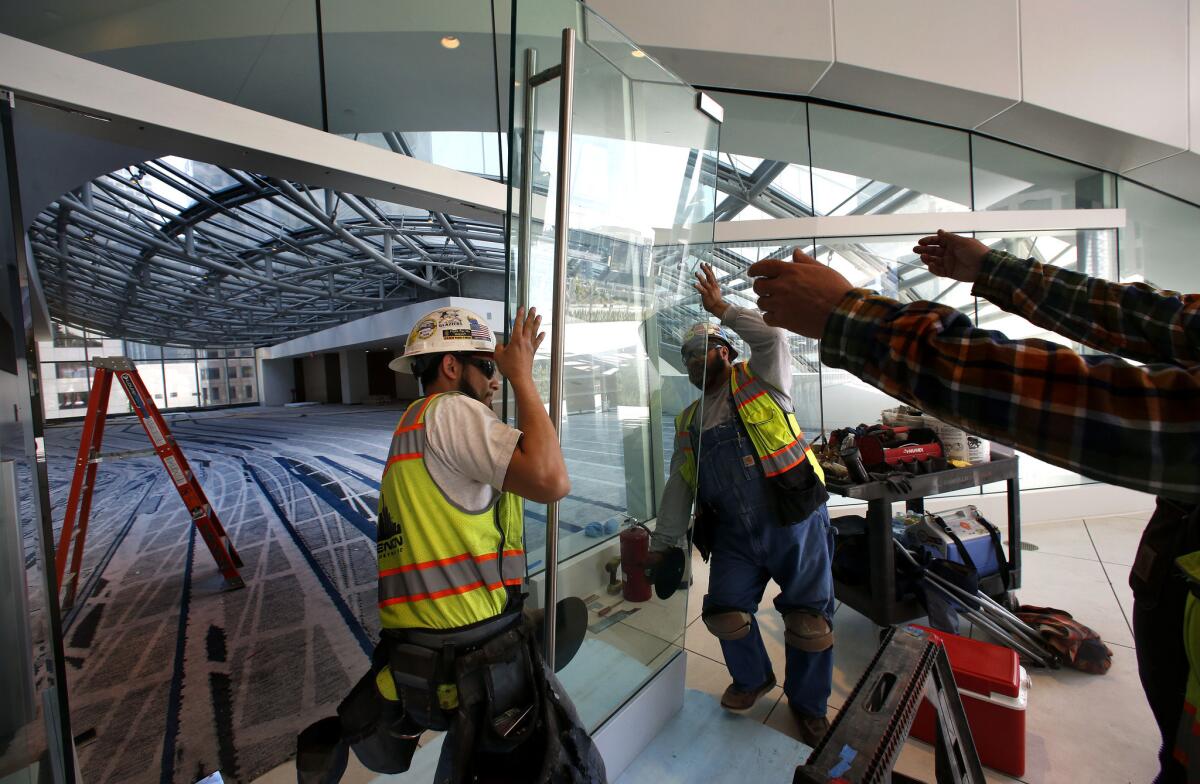
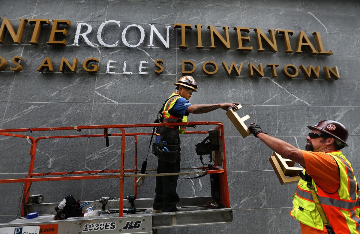
The punch list — construction-speak for all the details needing to be completed or repaired — had 35,000 items on it, and King was soon back on site, stepping through a clutter of scaffolding and cardboard boxes, overflowing dumpsters and pallets of building material that filled the rooms and hallways.
The nature of his job requires that after imagining, drawing and negotiating the high concepts, he bats clean-up, making sure all the details are in place. Perfection seemed elusive as he toured the 70th floor with senior production coordinator, Grit Leipert.
Through the windows, Los Angeles was a carpet of rooftops stretching to the horizon, but they hardly noticed. A coating of dust clouded the light fixtures hanging in the lobby. A gash marred the parquet angling across the restaurant floor, and a door in the men’s room fell well short of its jamb.
They made notes and took pictures, and then they were stumped over the color of caulking needed to seal a gap in the glass walls of the Champagne Shuttle, the elevator running up to the rooftop terrace. King set out across the floor looking for an answer, some thread of consistency as a rationale for their choice.
The matter may seem trivial — and easily resolved: clear yellows with age, so black it was — but no detail, King said, can ever be too small or fix too minor when delivering a $1.35-billion skyscraper.
Simply put, he said, “you don’t sell a new BMW with a broken headlight.”
King came to A.C. Martin in 2001, lured by the firm’s pedigree: City Hall, Arco Plaza and especially the Department of Water and Power building. Walking beside those reflecting ponds atop Bunker Hill, he saw in its simple and repetitive lines the signature elements of a landmark.
The Wilshire Grand, he believes, has the same potential: to give residents and visitors “a mechanism for seeing the city from a new perspective.”
He knew, however, that he couldn’t rely entirely upon its signature claim — the tallest building in the city — which would play like a novelty item, fun but not sustaining.
“Angelenos are fickle,” he said, “and every day things change in the city, which is why we couldn’t depend entirely on the view or the newness of the place.”
::
Once King understood the role that Banham could play in the design, he and his team turned to the 70th floor — the hotel’s lobby — where guests check in, the city surrounding them.
The space, King realized, could be “a synopsis of the entire narrative” and he set about linking the interior to the city, matching details with whatever ecology was immediately in view.
If they got it right, they felt the rest of the design would fall into place.
“We’re trying to choreograph a set of experiences for visitors to the building,” said King. “I don’t know if I’d call it subliminal, but we are trying to evoke a mood and a feeling.”
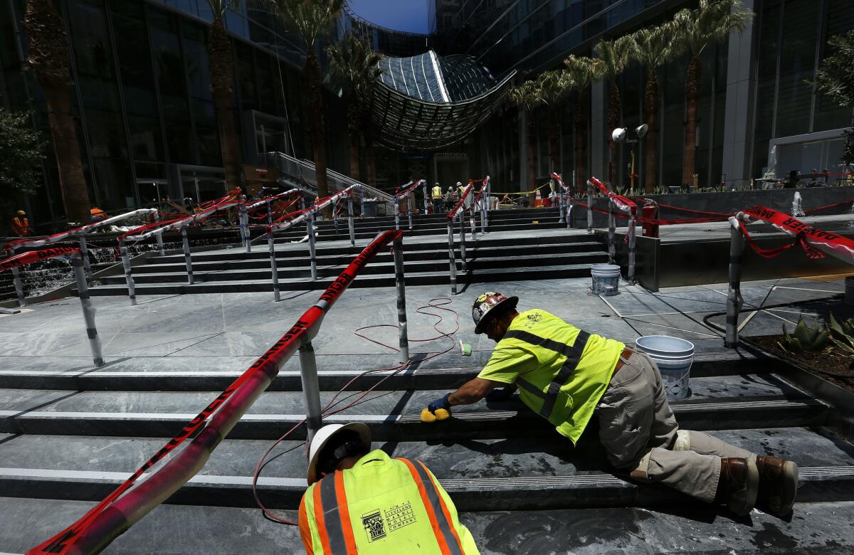
Through months of debate and discussion, hours of presentations in Los Angeles and Seoul, they fine-tuned the shapes and form, colors and texture. They consulted with artists, researched materials and dug deep into their collective sensibilities to come up with what they hoped would be a coherent plan.
The stakes may not be as critical as the fire elevators or seismic supports or as sensational as the exterior lighting, but King knew that anything out of place could ruin the desired effect.
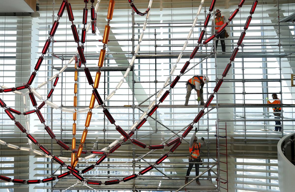
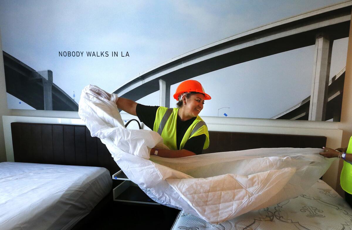
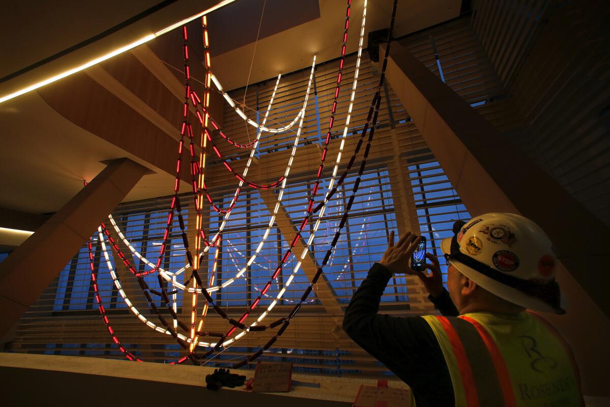
They designed a chandelier the color of automotive lights, red, white and amber, hanging from the ceiling above the check-in desk in a pattern based on a schematic of the 10 and 110 freeway intersections. The carpet and furniture in the adjacent lounge feature angular patterns replicating the city’s suburban grid.
The club space, facing the mountains, is decorated with pictures of the foothills. The carpet and furniture patterns mimic the lines of a topographic map.
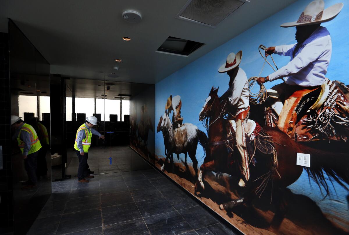
And in lieu of the beaches — too hard to see from this distance — they added a fifth ecology, downtown, in acknowledgment of its renaissance, so that the bar with its view of the neighboring buildings has a photo mural of the Studebaker dealership that once stood on this corner and a neon sign capturing the city street name mnemonic:
From Main we Spring to Broadway, and over the Hill to Olive. O, wouldn’t it be Grand if we could Hope to pick a Flower on Figueroa?
As they developed the concept beyond the 70th floor, the complexity multiplied. The size of the project was daunting: Some components — the plaza, the restaurant, the health club — were as large as previous jobs.
They championed the improbable, a mash-up in the steakhouse of 18th century Versailles with 19th century California rancho décor, and fashioned the whimsical: the pool deck with its foam stools, buoy lights and the No Dive Bar.
“It felt like we were working on 25 Swiss watches at once,” King said.
::
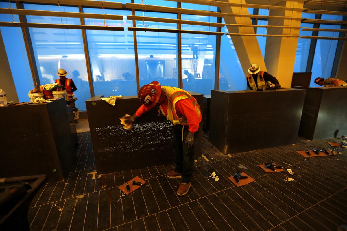
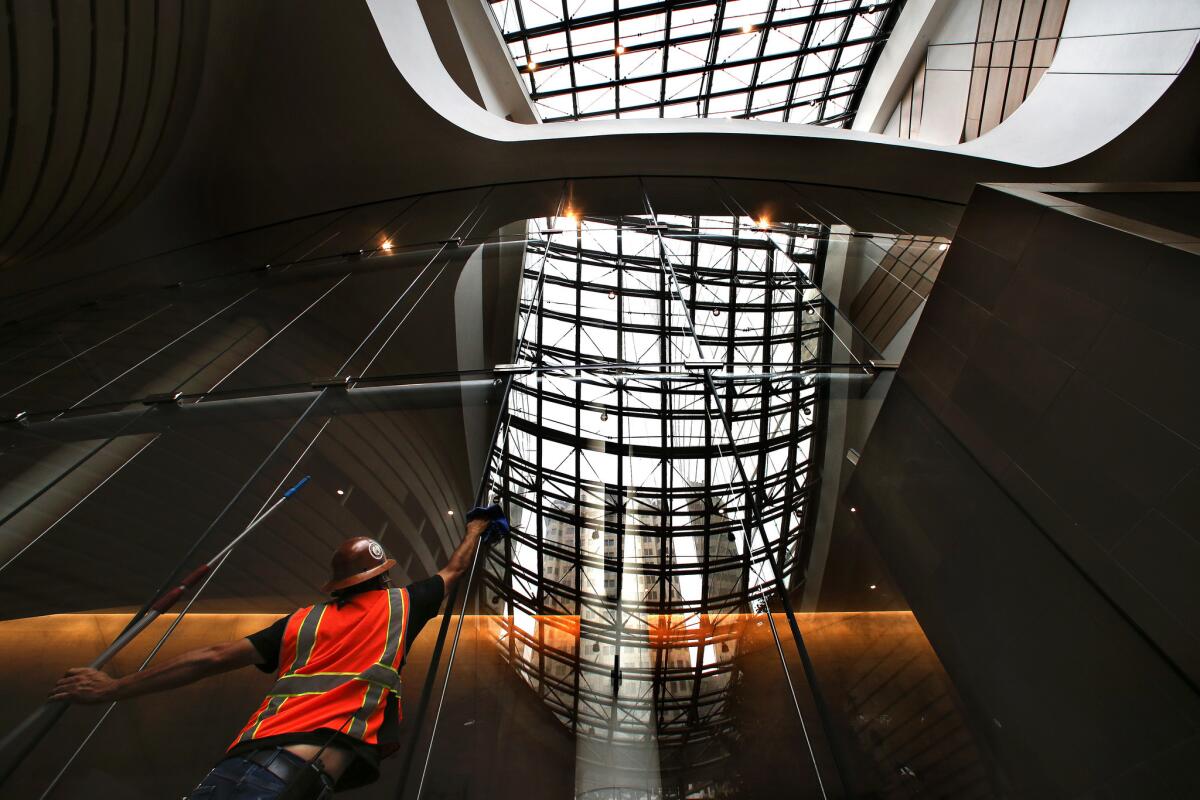
“This is Christmas,” King said as he and Leipert wandered through the atelier, a corner of the restaurant designed for more custom bites. Glass walls enclosed the charcuterie. The tasting table had a rough, hewn finish, exactly what they wanted.
Because their ideas have existed mostly on paper, any day on site is a surprise, revealing another stage of completion.
The challenge, King said, is not forgetting. Thirty conversations about a light fixture or the color of tile tend to obscure whatever the final decision was.
“Did I remember if I remembered or not?” is the question, he said, that keeps him awake at night.
While they had license to develop many of their own concepts, there were a few requirements. For instance, the hotel operator, InterContinental, requested a French steakhouse on the 71st floor “with a California twist.”
Uncertain what that meant, the team decided to pair the worlds of Marie Antoinette and the California vaquero, an unlikely association. But they liked how they played together: a parquet pattern from Versailles, a bar in the shape of the queen’s slipper, the color pallet from her gloves, juxtaposed with dark paneling and smoky glass.
Finding consensus on the design, King said, was at times like negotiating with “a three-headed monster” — the construction company, the project management company and A.C. Martin — each arguing for their own interests.
As a result, some elements were never built: a bar on rooftop terrace for specialized drinks, a waterfall in the pool area to mask traffic noise. In the end, King knows that he’s the only one who will miss them.
“This,” he said, “is when architects need to step out of their own heads.”
::
By late afternoon, King stood outside the lobby on the ground floor. He stepped among the extension cords, saws, sanders, make-shift tables, man-lifts, pavers, drop cloths and bubble-wrapped bollards.
Along a broad band of concrete above the entrance to the parking garage, contractors had applied blue masking tape and a vinyl template, the start of a mural.
This space in the porte-cochere had always been a challenge for King, a blank canvas that done right could set the tone for arriving guests. But he didn’t want it to compete with one of the project’s most-significant commissions.
Through the windows of the lobby, a sculpture designed by the Korean artist Do Ho Suh dominates the space, a three-story-high wash of colors, blending like a snow cone from red to yellow to green to blue. Up close, the pattern reveals itself to be nearly 86,000 figurines — each a few inches tall — rising atop one another, hands to feet: a high-concept homage to pluralism.
The mural, by contrast, had to be less flashy.
Borrowing from Ed Ruscha’s linear documentation of the Sunset Strip, King developed a pastiche of Los Angeles’ suburban skyline in silhouette: street lamps, billboards, palm trees and a few icons, Randy’s Donuts, the Watts Towers.
“I have always found the skyscape of Los Angeles not banal or unsightly,” he said. “It sets the tone for the city.”
He now just needed to decide which shade of gray — and there were six to choose from — would best capture this distinct ecology.
Twitter: @tcurwen
Sign up for Essential California
The most important California stories and recommendations in your inbox every morning.
You may occasionally receive promotional content from the Los Angeles Times.


