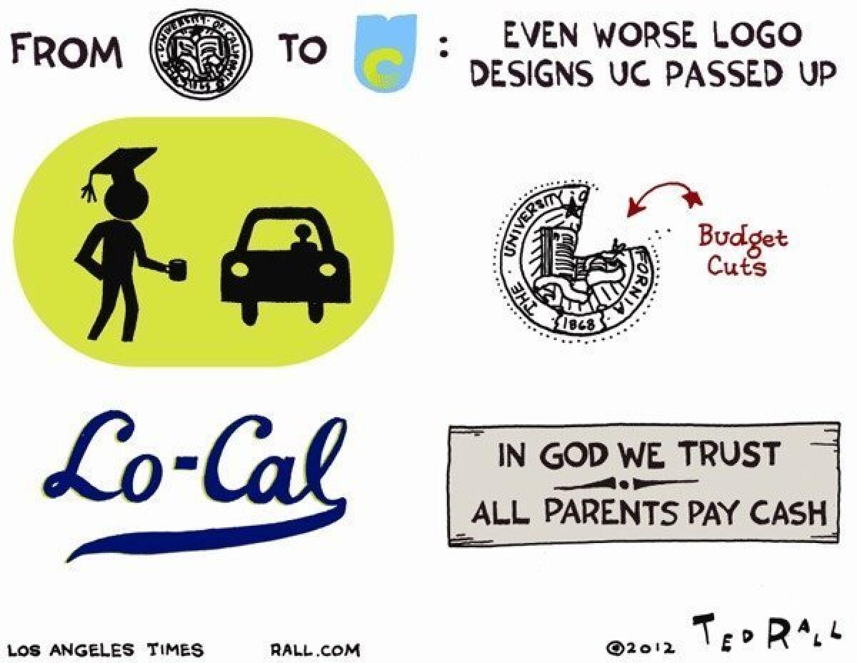
The UC logo: Some real-world design options

(Ted Rall / For The Times)
A new stripped-down logo for the University of California is drawing criticism for looking like a flushing toilet. In an age of austerity, that might be appropriate. Here, a look at other logo designs that reflect these lean, mean times for the once-vaunted state university system.
ALSO:
Photo gallery: Ted Rall cartoons
Slideshow: Worst insults to women in 2012
Anne Hathaway strikes a blow for an underwear-free America
Follow Ted Rall on Twitter @TedRall
More to Read
A cure for the common opinion
Get thought-provoking perspectives with our weekly newsletter.
You may occasionally receive promotional content from the Los Angeles Times.


