HOME RENOVATION : Vision and Revision : Three Expressions of Southern California’s Passion for Remodeling
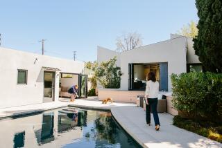
FROM THE STREET, this 1920s-vintage house looks much the same as it always has. But step around to the back and the dramatic change is apparent: A two-story addition, in contemporary Craftsman style, expands the house with 2,000 square feet of much-needed living space.
Wayne and Lana Selness bought this house in the Hancock Park section of Los Angeles despite the fact that it needed remodeling. They were attracted to its character--the central hallway, decorative plaster moldings, spacious upstairs bedrooms. But the kitchen was small and outdated, there was no family room, and the couple wanted a larger master bedroom and bath.
Brentwood designer Nick Berman, with the assistance of associate designer Cory Buckner, reworked the existing rooms and expanded the four-bedroom, 2 1/2-bath home to include five bedrooms and 4 1/2 baths.
“What I did is redefine the proportions and the scale of things. I opened rooms up and let light shine in,” Berman says. “Homes from this era tend to be dark and rather confined on the interior. Though the new rooms have a contemporary feel, they’re detailed in a classic sense so that they adhere to the character of such an old house.”
On the first floor, the new family room, kitchen and banquette open onto the back yard and pool. Although visible and accessible from the family room, the modern kitchen is divided by a long granite-top counter and cabinets enclosed with clear and ribbed glass. A banquette, located in a rounded bay, echoes the bay in the new master suite directly above it.
Materials are elegant yet simple. Grid patterns are repeated in glass block walls, windows and doors. “The colors--pale, soft blues, pinks and yellows on the walls and ceilings--are a counterpoint to the crispness of the shiny white trim and moldings. During different times of the day, the light reflecting off the colors creates subtly different moods,” Berman explains.
Berman designed many of the tables and sofas. Other furniture is a mix of classics by Donghia and modern chairs by Philippe Starck. Fabrics in the family room are in soft colors; in the living room, they’re dramatic.
“Nick always seemed to understand what we wanted, and his interpretation of that really works for us and this house,” Lana Selness says. “From the outside, our house remains appropriate for this older neighborhood. Inside, it now has the ideal balance of old and new.”
A Dark ‘50s Bungalow Opens Up to Airy ‘80s Style
When architect Kaye Secomb and her husband, David Spetner, found this three-bedroom, two-bath home in the Los Feliz area, they called it “the house nobody wanted.” But Secomb and Spetner saw potential in the bungalow’s small, dark rooms and outdated ‘50s styling.
After two months of remodeling, the house had an entirely new look. Secomb didn’t change the house’s basic layout, but she reworked its flow of space and she added skylights, larger windows and French doors to give it a bright, sunny ambience. Japanese, tropical and contemporary interior-design touches create what she jokingly calls an Ethno-Deco look.
Secomb, a native of Australia, wanted to connect her house to the outdoors, so she installed French doors in the kitchen and den / office that open onto a sunny terrace. French doors in the master bedroom lead to a rear patio.
In the kitchen, Secomb removed all the upper cabinets and installed windows along an entire wall. “My kitchen is modeled after an open-air kitchen in Bali--my favorite kitchen in the world,” Secomb says. “I tried to give it a similar feel--sunny, open, casual.
“I’ve used very little color in the interior of this house,” she says. “I’ve ended up with a lot of black-and-white furniture. Art, flowers and people’s clothing provide the color.
“David and I have discussed a formula that describes what we’ve done here,” she continues. “We’ve taken a house from the ‘50s, added some touches from the ‘30s and come up with something that suits the 1980s.”
Ethnic Influences Enliven a Simple Spanish Cottage
Bands of color encircle the wood-frame windows and front door. The rustic-pine door, a Mexican import, is finished with a sunny yellow wood stain. Even before you cross the threshold, it is apparent that this house is owned by someone who is not afraid to express herself.
Claudia Grau, who designs and sells contemporary sportswear at the Melrose Avenue boutique that bears her name, bought this Spanish-style two-bedroom, one-bath house in West Hollywood last year. “It was the only one I liked and could afford,” she explains.
After a contractor completed the major work--repairing the foundation, removing the wall between the dining room and kitchen, adding a large window in the second bedroom and remodeling the bathroom--Grau hired a friend, designer / artist Paul Glynn, to help add decorative touches.
Glynn, who owned the innovative but now-defunct Melrose boutique, Cowboys & Poodles, fashioned the front fence, the frames around the doors and windows, kitchen cabinets and breakfast-room chairs.
Glynn gilded Grau’s bathroom medicine chest and painted the natural-looking artificial rocks in the living-room fireplace. Glynn also installed a cracked-tile back splash in Grau’s kitchen above the granite counters.
After construction, there was not much money left for decorating, but Grau was able to pare costs by buying some of her new furnishings (such as her metal-frame furniture and the front door) in Mexico.
“The bold color combinations used in and on Mexican and Central American homes are so positive and upbeat,” she says. “I wanted to bring some of these same qualities to my home.”


