New Flair for Two Old Museums : London: Architects and critics are blasting the staid new wing of the National Gallery, but the Queen loves it. And so does her son.
LONDON — After 50 years of trying, London’s National Gallery at long last opened a new wing today on Trafalgar Square, an addition designed by American architects and highly controversial among architectural critics.
Queen Elizabeth II on Tuesday officially unveiled the $60-million extension--the Sainsbury Wing that will house the gallery’s superb collection of 200 Early Renaissance paintings.
Taking note of the controversy over the addition, the Queen declared that it was to the credit of the Sainsbury design that it had become a “burning issue. It shows how, these days, we cherish our national institutions and the centers of our great cities,” she said.
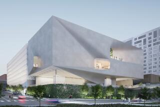
The building has come under sharp attack, as had previous designs for the sensitive site in central London. Basically, most critics praise the interiors in which the pictures are displayed. But they have expressed disappointment in the glass and limestone facade by the post-modernist, husband-and-wife team of Robert Venturi and Denise Scott Brown.
The Prince of Wales, an architecture buff, described the new extension on Monday as “a great success” and “a building of which London can be proud.” But architectural historian Gavin Stamp called the building “a camp joke, pretentious architectural rubbish and an insult to London.”
The running critical battle reflects the deep dissatisfaction among Britons with the mediocrity and vulgarity of many buildings put up since World War II.
Critics assert that modern architects, abetted by city planning officials, have desecrated the centers of major cities such as Birmingham and Manchester with ugly parking garages and ill-designed shopping malls, while constructing cheap, unpopular high-rise apartments for the poor.
Much of the postwar architecture has been criticized in this way; in some cases, it has been condemned and destroyed. And even such a high-profile complex as London’s South Bank with the Queen Elizabeth Hall for music and the Hayward Art Gallery--reflections of the “brutalism” or bunker school of modern architecture--are now roundly censured and may be torn down.
The background of the new wing of the National Gallery, one of the world’s great art museums, has been marked by storm and strife.
The idea for an extension dates 50 years when it was clear that the original National Gallery building, designed by William Wilkins in 1833, was short of space, and the furniture building next door was bombed out. But the government was short of money for museums; while several plans were proposed, the site remained vacant.
In 1959, the government bought the land for the museum. The Sunday Times sponsored an architectural competition for an addition. But a panel of experts, from 250 entrants, chose a bunker-style design so unpopular that the newspaper dropped the idea. In 1981, the Thatcher government announced a new competition for an office and gallery on the site. This time there were 79 entrants--of which seven were invited to a second phase of competition.
The final designs provoked various reactions among the five advisers to the museum trustees, as well as other architectural experts. After acrimonious debate and a further competition, a design was chosen in 1983. The final choice, by Ahrends Burton & Koralek, was a blocky building with a strange tower. It pleased no one--least of all Prince Charles, who, in a speech to the Royal Institute of British Architects, called the building, “a kind of vast municipal fire station complete with the sort of tower that contains the siren . . . a monstrous carbuncle on the face of a much-loved and elegant friend.”
In the resulting furor, no one was surprised when the design was rejected; the museum trustees ordered architects to return to their drawing boards. Philadelphia-based Venturi Scott Brown was a late starter in this competition, but in 1986 won the contract for the Sainsbury Wing, funded by the brothers who run the British supermarket chain. Critics have howled from the moment the Venturi design was shown, and their views were circulated widely because Britain’s national newspapers all have architecture writers eager to discuss plans for a national institution.
The Venturi exterior was described as bland, derivative, shallow, artificial, mannerist, pretentious, or simply a joke.
“It is a great disappointment,” wrote critic Derwent May. “Seen across the square it is like a bland, curving cliff of stone with several large garage entrances in it.”
Martin Pawley, in the Independent, observed that, “All of Venturi’s elaborately slashed, cut, broken, bent and distorted classical detailing is smothered in gray, and the effect is to induce a kind of claustrophobia.”
There were a few favorable comments, with post-modern architect Terry Farrel declaring: “I believe the whole building is a quiet compliment to London.” But perhaps the most scurrilous comment was from the Architectural Review, which called the extension, “a piece of picturesque, mediocre slime.”
Venturi, 66, the latest winner of the prestigious Pritzker Prize, has kept a sense of humor about his design, declaring of the Review criticism: “I particularly enjoyed the qualification mediocre. It was not just ordinary slime, it was mediocre slime.
“I think good architecture often provokes extreme reactions,” he said, adding, “but I don’t really think we know what to expect, since we have never done a building that is so interesting to the general public. Certainly compared to the United States, the press here takes, let’s say, a more expressionistic approach to architecture.”
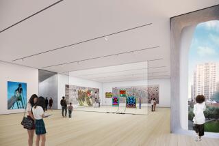
Venturi has been cheered for his interior spaces, which, in 16 elegant galleries, provide a critically lauded home for the museum’s collection, displayed chronologically from Giotto to Durer. The wing boasts a grand staircase from the street entrance leading to the picture galleries with their high ceilings and lucid layout.
Never, the critics agree, have masterworks--such as those in the collection by Duccio, Masaccio, Uccello, Van Eyck, Van der Weyden, Crivelli, Botticelli, Lippi, Pollaiuolo, Piero Della Francesca, Antonello, Memlinc, Bosch, Raphael, Bellini, Mantegna and Leonardo--been shown to such advantage.
As critic Tanya Harrod said, “Having had a little professorial fun with the Sainsbury exterior, Venturi and Scott Brown have created some of the most beautiful galleries built in Europe since the war.”
Certainly, the museum, its trustees, its benefactors and its staff are fully satisfied. As Director Neil MacGregor put it Monday: “It is a most remarkable building. After 50 years, it has turned out better than we could have hoped.”
More to Read
The biggest entertainment stories
Get our big stories about Hollywood, film, television, music, arts, culture and more right in your inbox as soon as they publish.
You may occasionally receive promotional content from the Los Angeles Times.


