ARCHITECTURE : L.A. County Museum’s Addition Is Facade in Search of a Purpose
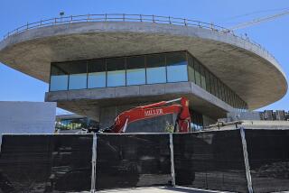
When future archeologists unearth the Robert O. Anderson Building of the Los Angeles County Museum of Art from beneath the La Brea Tar Pits, they might wonder what happened to the rest of the building.
This huge hulk of a structure, looming 100 feet over Wilshire Boulevard, is a facade in search of a building, a grand entrance in search of a purpose, a collection of materials thrown together in such a slapdash manner that you wonder whether anyone ever thought about it. It would be funny, if it were not so sad: Los Angeles’ major cultural statement about itself, 270,000 square feet of art temple, is a failure as a piece of civil architecture.
Perhaps the problem with the Anderson Building is that it was designed by a New York firm that thought it was catching the spirit of Los Angeles while showing us how you make truly important buildings.
When Hardy, Holzman, Pfeiffer Associates created the new wing in 1988, it hoped to cover up and organize the loose confederation of pavilions that William J. Pereira had created for the museum in 1964.
The new building was meant to provide a monumental presence to this modernist grouping that would give Wilshire Boulevard a wall, pedestrians a place to enter and the whole complex a core. At the same time, the building was to be a billboard for the cars speeding down the boulevard. These contradictory impulses help explain the mixture of limestone, glass-block bands and green terra-cotta that steps up a slight hill.
The building was meant to be large and imposing, a solid wall housing a formal entrance, and at the same time only a face, an unfinished gesture propped up to the street. The real bulk of the program is housed in a box clad in curved panels of pinkish-white porcelain enamel panels that looms behind the fancy facade.
It could work if the facade were not so thick, so large and made out of materials that seem so unconnected with anything around it. The stone stands for monumentality, the glass block for speed and L.A. zippiness, but neither have any reality beyond that idea, and they have very little to do with each other.
The porcelain panels were no doubt used in an attempt to break the box down visually into decorative pieces, but the result is that the Anderson Building always looks about to shed its popping panels.
What makes it all even worse is the lack of any kind of functional logic. If you manage to park your car somewhere in the neighborhood to the south, you enter underneath an 80-foot-tall arch, march up a series of grand steps (unless, of course, you are differently-abled, in which case you are not allowed the whole experience) while pools of water separate you from an ominous black donor wall, and green columns hold up a kind of industrial shed roof made of a translucent material called Kalwal.
At this grand promenade, you end up lost in front of a collection of ticket windows, bridges and columns. Turn twice to your left, and you’ll find the narrow glass slot that lets you into the cavernous, but badly organized galleries of the Anderson Building. Inside, curators struggle to make sense of the strange configuration of the building, which includes an acute angle to the west, where the building peters out to a pointless point. And in case your eyes ever get tired, there are the balconies, whose balustrades are formed by wavy pink lines interwoven with the gray steel structure.
Major civic institutions are supposed to be grand buildings where a world that might not normally make sense is laid out in clear rhythms of spaces and ordered by an emphatic architecture. The Anderson Building is a mess, a jumble of forms thrown up from across the continent and left to impress us only with its size and its incompetence.
More to Read
The biggest entertainment stories
Get our big stories about Hollywood, film, television, music, arts, culture and more right in your inbox as soon as they publish.
You may occasionally receive promotional content from the Los Angeles Times.


