Mail Takes the Creative Route
SAN DIEGO — Unlikely as it may seem, conservative Rancho Penasquitos now has San Diego County’s hippest post office.
Bucking the odds in a community where conservative, vaguely Mediterranean stucco buildings with red tile roofs are king, architect Dick Friedson convinced community leaders and postal officials to go with his unabashedly unusual design.
The result may be short on traditional nostalgia, but it is long on creativity. Best of all, though, this is a public building actually designed with the public in mind.
Since it opened in September, the new post office has been home to 32 mail carriers, three supervisors, nine clerks, two custodians and a fleet of 30 mail trucks.
Friedson divided the $2.8-million building into two sections: a 4,500-square-foot lobby and customer service area, and a 16,500-square-foot, bright blue-green stucco warehouse behind it.
From out front, the warehouse is hidden by a pair of walls: a front facade of glass block, and, behind it, a thick, taller wall of bright red sandstone that seems to slice between the building’s two sections. (In fact, this wall reappears several times within the building).
Appropriately, a significant portion of the design effort and budget went into the building’s public spaces.
Enclosed by front and side walls of glass block, the main lobby has an inviting transparent quality. As you approach, you can see people inside. Once inside, you can look back through the glass block wall at the amorphous shapes of cars and people moving outside.
To let locals know that postal officials are accountable and accessible, Friedson gave Station Manager Sigrid Alexander a highly visible front corner office. Most workdays, you can see her at work behind the big square window set in the glass block wall. Visitors often wave and exchange smiles with her.
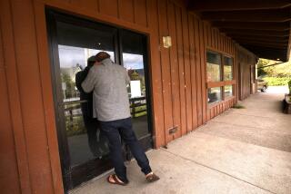
Punctuated by numerous windows and a pair of entry-exit doors, all topped by gray granite lintels, the glass block wall is a well-balanced composition of carefully placed squares and rectangles. To enhance the intermingling of indoor and outdoor spaces and the sense that the public is welcome, Friedson detailed the front wall with a series of inverted bay windows that jut back into the lobby, bringing in natural light, allowing glimpses inside as visitors cross in front of the wall toward the entry.
And what an entry. Two main doors are plain, standard-sized. But they are marked by two bold and artful strokes Friedson dreamed up: huge cubes of stainless steel, buffed to a swirled finish by Leucadia artist James Sable. These art pieces are poised over each door like high-tech boulders.
Friedson’s final design was the result of a push-pull process involving community leaders and the Postal Service.
The initial design, completed in 1987, featured a white stucco front wall that arched from one side of the site to the other, screening from view the trucks and loading docks at the sides of the building.
“When we presented the original design to the town planning group, there were a lot of questions raised regarding the compatibility with the rest of the community,” Friedson said, adding that community leaders were also put off because the first design was accomplished without their input.
Federal budget cuts delayed the project until 1990. In the meantime, several Penasquitans wrote their elected officials to ask for more of a say in the design process. When the postal service geared up its design effort again, it asked Friedson to solicit opinions from members of the community planning group.
“They had some idea that (the original) looked like an aircraft hangar,” Friedson said, laughing. “They couldn’t see what it had to do with the community.
“So we tried to reflect some of the color and richness we found in the red tile roofs with the (post office’s) red Sedona sandstone, without compromising the basic theory of the design, the separation of the public and private spaces,” Friedson continued. “Also, the first proposal was very shy of landscaping, so we added quite a bit. After a few compromises here and there (including the approval of the boisterous blue-green color of the back building as a fitting contrast to the red sandstone wall), they unanimously approved the scheme.”
Clearly, Friedson is a worshiper of modern ideology; this building is about simplicity, not frilly historical decoration. But within the confines of its straight-forward design, the building manages to create many subtle and intimate moments for its users.
The warmth is in the details.
A few rectangular hunks of the same sandstone used on the large piercing wall are inlaid in the plain concrete floor to add just the right amount of color and textural variation.
In the lobby, the building’s black steel frame is plainly exposed: This functional core doubles as decoration. The rhythmic repetition of forms enclosed by the frame lends the lobby a sense of order.
In the service area, on the right-hand side of the lobby, a long, narrow steel counter arcs gently toward the service desk, shaping the line of waiting people into a soft curve.
The larger, left-hand portion of the lobby is devoted to cube-shaped banks of post office boxes, paneled with light birch.
Built-in steel-and-glass tables--at both standing and wheelchair heights--cantilever gracefully out from the building’s steel frame.
Outside, Friedson needed a fresh landscape plan to go with his provocative design. He dreamed up a series of steel mesh frames that will serve as trellises for creeping fig vines. Once the vines twist around these mesh armatures, all you’ll see are three-dimensional hedges that seem to float in space--call them New Age topiaries, if you like.
All indications are that the citizens of Rancho Penasquitos love their new post office--a radical contrast to a sprawling, Mediterranean-flavored mall nearby, and the plain stucco box a few blocks away that houses the fire department.
“I think the new post office makes a beautiful statement for the community,” Alexander said. “I love it at night when the lights come on and light up the glass.
“The response I’ve gotten from customers--they love it. They are awed by the beautiful Arizona sandstone inside. No one has said much about our bright green building out back. I think it’s pretty much grown on them.”
More to Read
Sign up for Essential California
The most important California stories and recommendations in your inbox every morning.
You may occasionally receive promotional content from the Los Angeles Times.
