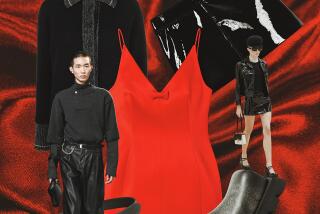
Color It Bold : Gone is the natural look, especially at cosmetic counters, where the palette leans toward deeper shades.
- Share via
Natural makeup looks are officially dead, as far as trend-setting cosmetic companies are concerned. And even though fall’s cool breezes have yet to hit full throttle, cosmetic counters are in high gear promoting the season’s deeper color palette. The subdued neutrals and natural shades are falling out of favor, clearly overtaken by a renewed interest in heavily painted looks.
At Woodland Hills-based Sebastian International, the company’s Trucco line features fall colors loaded with a metallic edge. Red lipsticks with gold flecks are offered, as are creamy rose, gold and platinum shades designed for lips, eyes and cheeks. Like the frosted items introduced in the spring, the ’94 metallics are applied lightly, and have a translucent--as opposed to opaque--appearance.
The new sheerness is what makes the heavy makeup looks different from those so popular in the ‘70s, says Renee Arnett, office manager of Frends Beauty Supply, a popular North Hollywood cosmetics emporium. Whether women will truly embrace the dramatic new looks remains to be seen.
“I love it,” Arnett says, “but women have been into neutral colors for so long, it might be hard to win them over.”
For those who want to experiment, Frends sells a variety of products women can use to achieve the new heavier looks. For ruby-red lips, Arnett believes the best for fall are available in her CeCe line ($6 per tube.) To create blackened kohl eyes, Arnett suggests a felt eyeliner pen from her Dramatics line ($6.) And for matching spider-like lashes, she likes Lissee mascara ($6).
*
KEEPING TABS: The cheerleaders at San Fernando High School are wearing their school spirit from head to toe, thanks to Kaepa’s Snap-In Logos.
The tiny triangular tabs, intended for the tops of sport shoes, can be snapped in and out of place on whim. School colors can be sported on game day, and the many options--orange, black, purple, green, yellow, mauve, red and blue--provide plenty of combinations to celebrate a holiday or match an outfit.
Donisha White, a 17-year-old San Fernando High cheerleader, uses the logos as she would any other standard fashion accessory.
“The tabs are fun; people always comment on how cute they are on game days. I like them not just because we can wear our school colors, but because we can change them to match our outfits,” says Donisha, who goes for the all-white look if she doesn’t have the exact colors to match her outfit.
You don’t have to be a cheerleader to snag a pair of the shoes. Lady Footlocker in Sherman Oaks carries the Kaepa line and logos.
*
C-C-COLORS: Spring’s blandish neutrals and the all-black looks so prominent among the ultra-cool set are being edged out by bright shades.
However, many working women are puzzled by how to pull off the look without blinding clients and colleagues.
Several designers, including Los Angeles-based Mark Eisen, paired bright jackets with black turtleneck sweaters. (Eisen’s collection is available at Jona in Studio City.)
Design director Andrew Dibben says the reason for this fashionable mix is that black, really a non-color, serves as a buffer for what might otherwise be too shocking. Another way to diffuse color overkill: incorporating texture, such as the same-tone mix of a tweedy boucle suit with a flat, shiny satin blouse.
“By doing that, you avoid a big space of color in the same dimension,” Dibben advises.
At Ron Ross, Patty Ross says her customers are less inclined to adopt the bold-color trend as a major element in their fall wardrobes.
“My customers don’t really go in for loud fads. I just didn’t see them wearing, say, an orange sherbet jacket,” she says. Instead of investing in expensive fall pieces for a trend she was unsure about, Ross decided to include mohair twin sweater sets (tiny under-sweaters with cardigan toppers) in bold shades of lime and fuchsia that sell for $100.
Trendiness aside, a person’s choice of color is usually an indicator of their mood and outlook on life. For instance, people who are drawn to green are in search of security because of upheaval in their lives, according to Cynthia Cornell, projects coordinator for the Santa Barbara-based Wagner Institute for Color Research.
And for those people who want to use color to alter their mood or that of another, red increases appetites for food and l’amour , Cornell maintains. (And you thought it was just for Valentine’s Day.)


