- Share via
Denver — For centuries, museums have taken their architectural cues from Renaissance palaces. The Louvre inhabits a Paris building that once served as an actual palace. And the concept remains embedded in the Beaux Arts architecture of so many museums, as well as their names — including the Palacio de Bellas Artes in Mexico City. San Francisco’s ornate Palace of Fine Arts, a Beaux Arts confection built for the Panama-Pacific exhibition in 1915, is definitely channeling that vibe.
The Denver Art Museum, however, eschews the palace for a castle. And by castle, I don’t mean a picturesque Cinderella chateau from the Loire Valley. I’m talking about a structure inspired by the medieval stone fortifications you might catch as a backdrop on “Game of Thrones” — a building that begs you to douse an invading army in boiling oil.
Completed in 1971, the Denver Art Museum’s tower is a bit of a unicorn. It’s the only building by Italian architect Gio Ponti in North America — though the building isn’t entirely his. It was a complicated architectural arrangement between museum director Otto Bach (who dictated the scale and arrangement of the galleries), Denver architect James Sudler (who was charged with knitting Bach’s ideas together onto an irregularly shaped site) and Ponti, who was hired to work on the building’s exterior. This was a way of having a prominent international name on the project without the expense of paying for a full design.
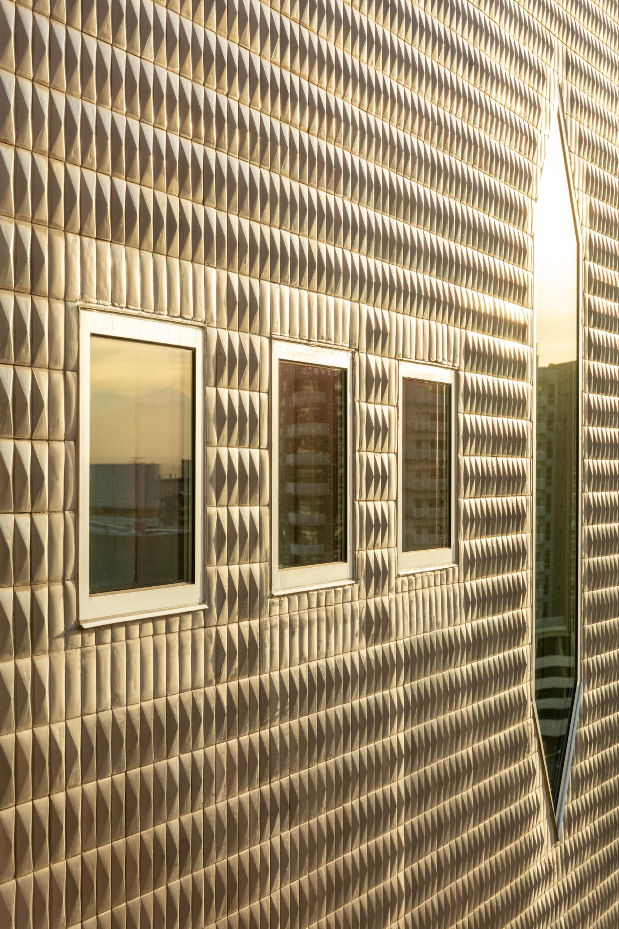
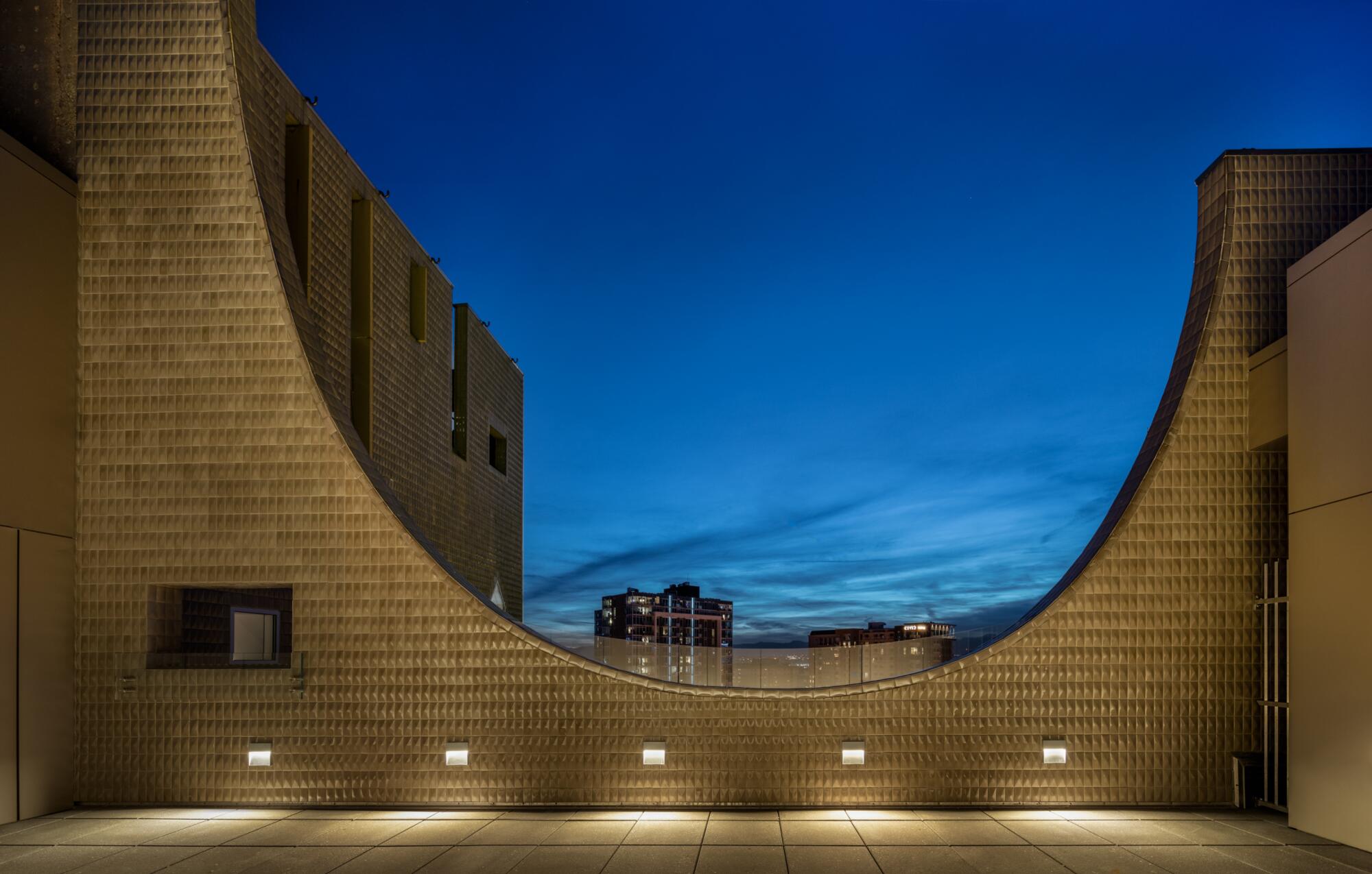
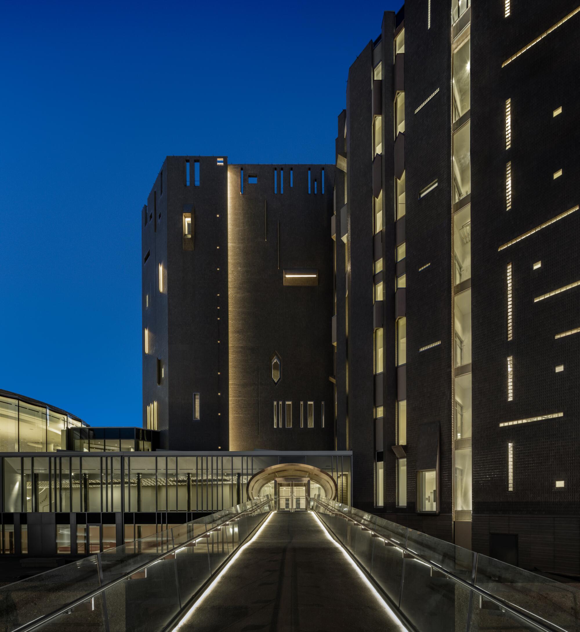
As a result, the Ponti-Sudler-Bach tower is a bit of a Franken-building. Its general demeanor is defensive, but its skin of textured gray tiles (Ponti’s contribution) comes alive depending on the angle of the sun, producing exuberant flashes of golden light. The crenellated roofline may feel antiquated but the pattern of the slender windows, some in the shape of a diamond, evoke an 8-bit digital design. And there are the unexpected touches of midcentury glam, such as a ground-level entrance framed by an oval of gleaming steel — resembling a portal to another dimension.
The Martin Building, as the museum’s tower is formally known, probably would be more of an icon were it not impossible to photograph. An Instagram influencer it is not.
Nonetheless, Ponti and the Martin Building have both been resurfacing lately.
In 2019, Ponti — a wildly prolific 20th century architect who was renowned in his day but whose work remains obscure in the U.S. — was the subject of the exhibition “Gio Ponti: Loving Architecture” at the MAXXI museum in Rome. Last year, Taschen published one of its behemoth tomes on the architect’s designs. The 15-pound monograph, “Gio Ponti,” covers everything from Ponti’s opera sets to his commercial buildings. (He is the architect behind Milan’s gently tapered Pirelli Tower.)
For the record:
7:08 p.m. July 28, 2022An earlier version of this article noted the 50th anniversary of the Denver museum. It’s the 50th anniversary of the museum’s Ponti building.
This was followed, last year, by the 50th anniversary of the Denver museum‘s Ponti building. Marking the event was the completion of a five-year renovation and expansion project that has left the building looking refreshed while adding critical infrastructure.
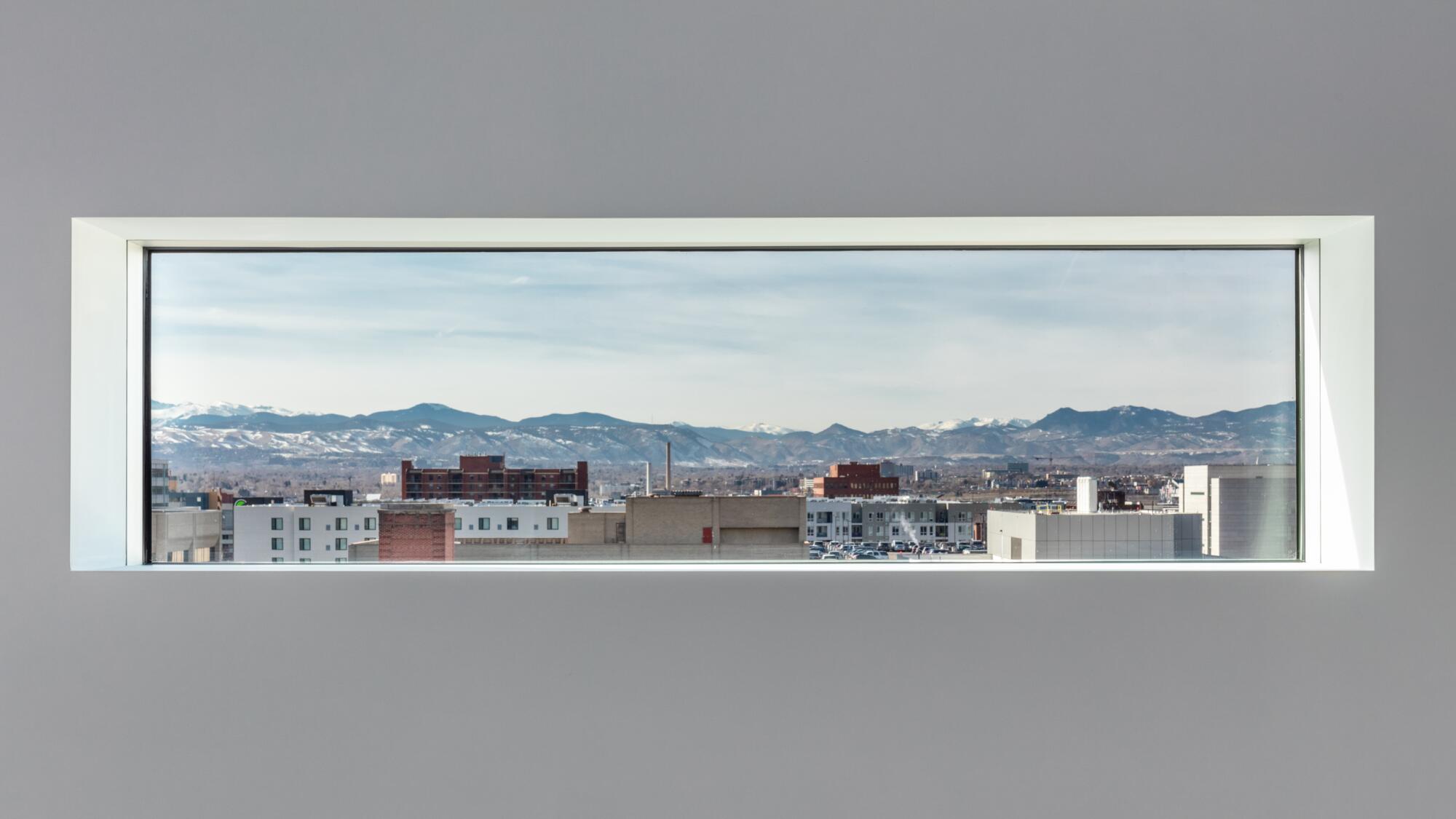
The $150 million project, led by Boston-based architectural studio Machado Silvetti, in collaboration with Denver firm Fentress Architects, has rebuilt gallery spaces anew, uncovered boarded-up windows and added a set of elevators to accommodate the museum’s increased traffic. They also added gallery space for Western art on the seventh story, in an unused space Ponti had originally imagined as a lounge.
“It’s really amazing,” says Machado Silvetti founding principal Jorge Silvetti. “To locate the art of the American West in this floor, where you are looking at art and actually seeing the American West — you are seeing mountains, the Rockies, in the distance.”
Among its myriad changes, the project has given the Ponti building a more welcoming presence at street level.
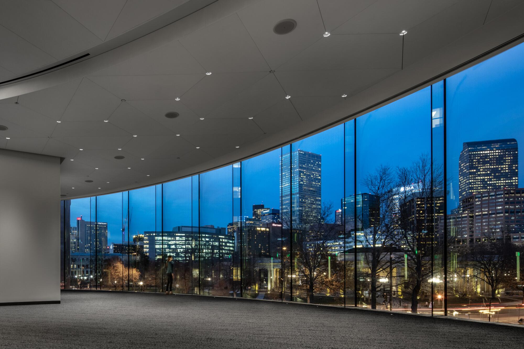
Machado Silvetti removed a low-slung ’50s-era building that once served as the Ponti tower’s unremarkable point of entry and replaced it with the 50,000-square-foot Anna and John J. Sie Welcome Center. This splashy structure contains a ticketing area and a conservation studio, as well as a cafe and restaurant. But its distinguishing feature is an ebullient second-story flexible event and education space. Built in the form of an oval and clad in floor-to-ceiling concave windows that give the façade a petal-like outline, the structure frames striking views of Denver’s downtown.
To the north of the welcome center, the architects added a sunken courtyard. It too bears an oval form, a shape that echoes an auditorium Ponti had originally designed for that site — which, like the rooftop lounge, went unbuilt. The courtyard now serves as a landing pad for student groups, who had previously found themselves jammed onto the sidewalk as they spilled out of school buses.
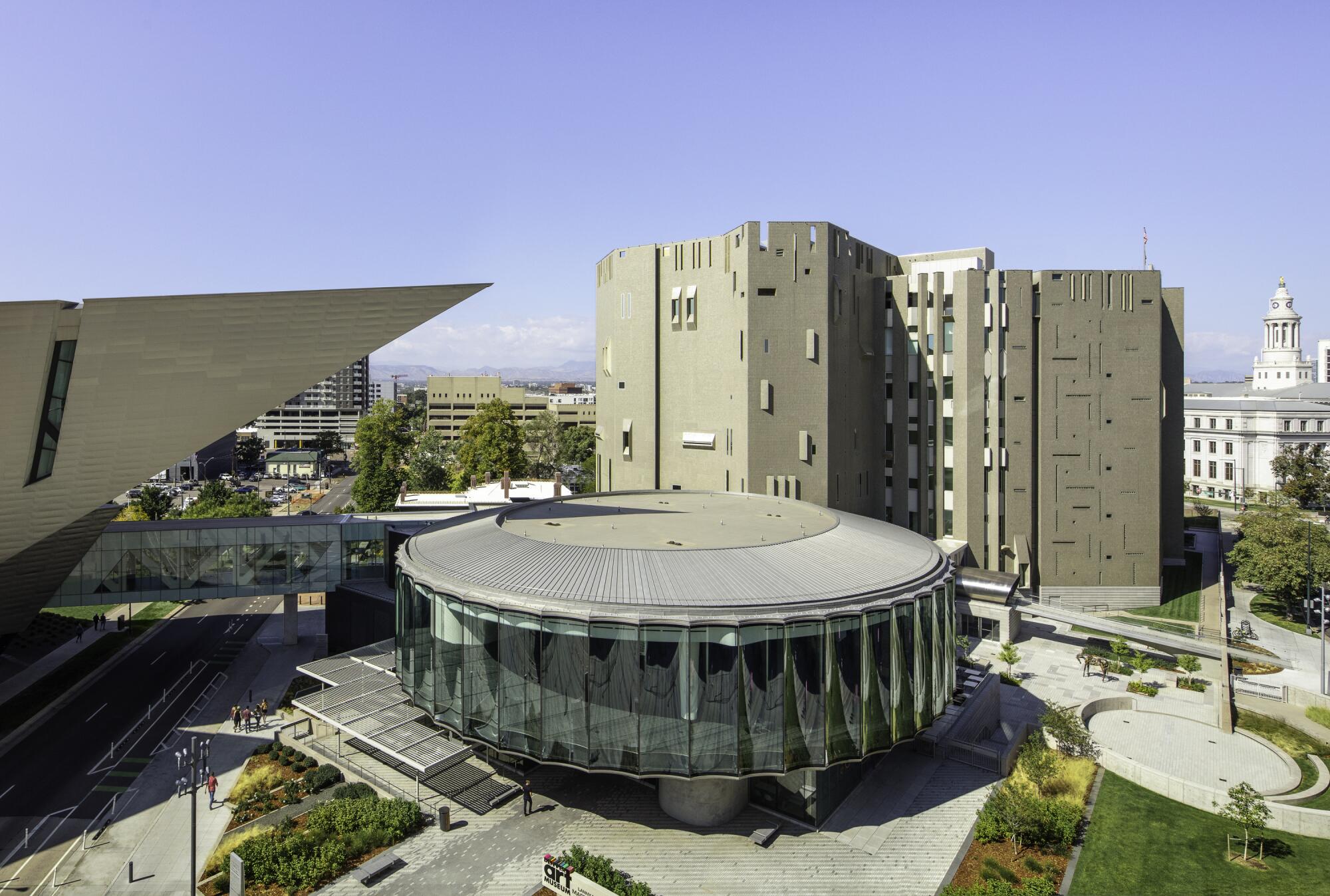
Most significantly, the renovation has reimagined the museum’s campus, which also includes a separate 2006 building by Daniel Libeskind to the south, bringing some unity to a plan that felt like less than the sum of its parts. The reclusive Ponti tower was separated by a roadway from the Libeskind building, a pointed titanium shard that looks like a space ship that has crash-landed in the middle of Denver (and is sympathetic to neither the city nor its art). To the east lies the Denver Public Library, a handsome yet imposing Postmodernist structure from 1995 by Michael Graves.
Machado Silvetti’s fluid oval pavilion brought a soft translucence to this overstuffed intersection; it is in conversation with all the capital “A” architecture without trying to compete with it. (The firm has experience treading carefully into complex architectural arrangements: It refurbished the Getty Villa in 2005, adding an amphitheater, auditorium and cafe — an expansion that was hailed for its refinement.)
Silvetti has long been intrigued by Ponti’s work, having visited some of his more remote projects — including a hillside residence built for the Planchart family in Caracas, Venezuela, in 1955, which seems to derive its structure from the views it frames. “This was an architect that would be rarely if ever mentioned in academia when I was a student,” says Silvetti. “Yet in terms of a breadth of work, and also in terms of versatility, adaptability, an energy that responded to the times, his interest in technology, in materials — he’s remarkable.”
‘Traitor, Survivor, Icon: The Legacy of La Malinche’ at the Denver Art Museum reconsiders a foundational figure in Mexican national mythology.
The story of how Gio Ponti came to design a museum — or part of a museum — in Colorado is one of propitious timing.
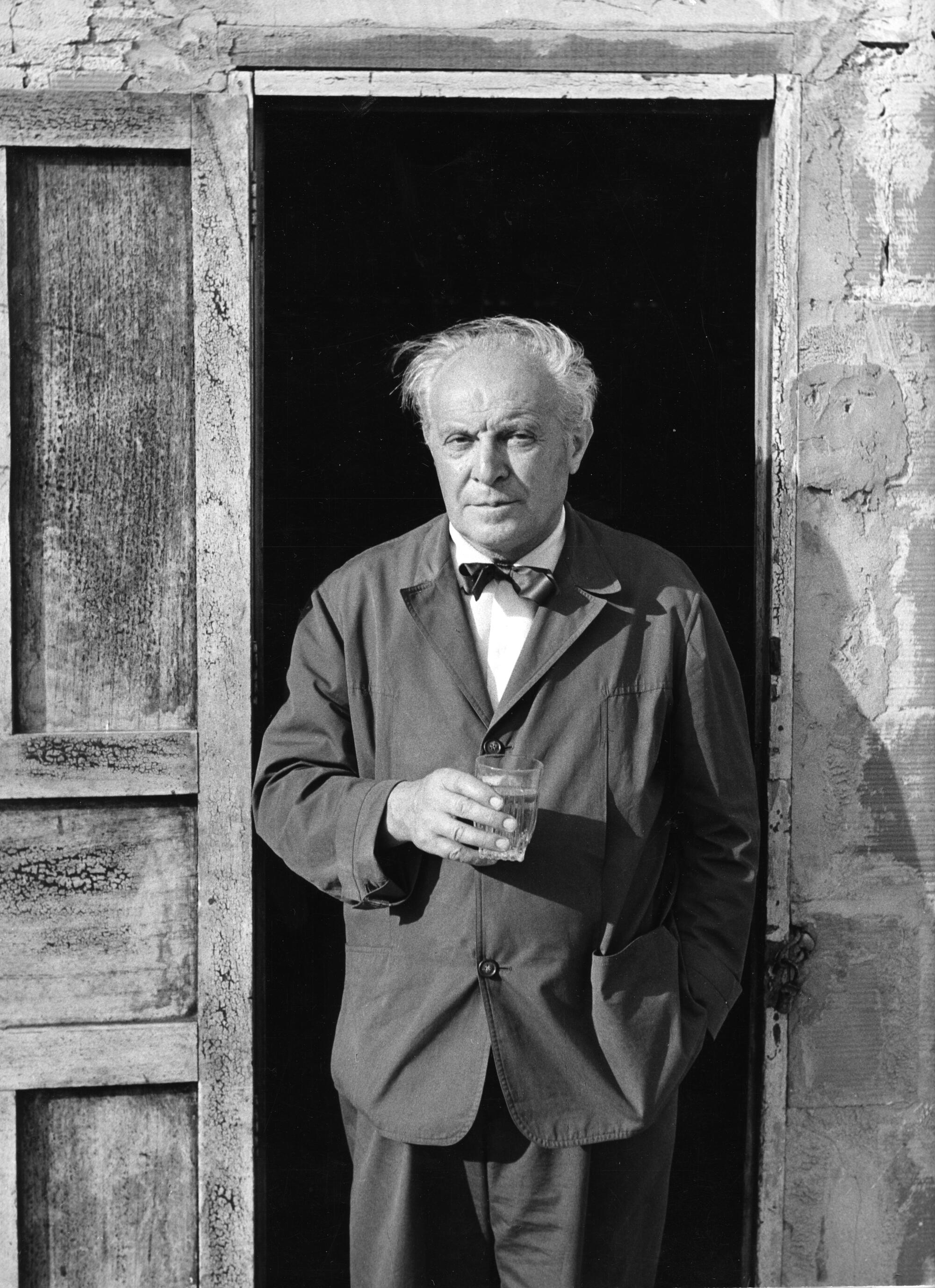
Ponti was born in Milan in 1891; when the Denver Art Museum came calling, he had already amassed a staggering portfolio of work. He had designed apartment buildings, a convent and various commercial buildings — not to mention furnishings, textiles, ceramic tiles, dishware, flatware, an espresso maker and even a toilet. He’d worked on the interiors of cruise ships, such as the Andrea Doria (which famously sank off the coast of Massachusetts in 1956), and served as founding editor of the (still-published) Italian design bible Domus.
Ponti was a singular figure. “He was a Modernist, but inspired by Classicism,” says Darrin Alfred, curator of architecture and design at the Denver Art Museum, who organized “Gio Ponti: Designer of a Thousand Talents,” an exhibition of Ponti-designed objects now on long-term view at the museum. “He had an interest in the industrial, but he was just as interested in the hand of the artist.”
Silvetti agrees: “He has many features that have to do with Modernism. But he was much more versatile, never dogmatic.”
By the time the late 1960s rolled around, there was little Ponti hadn’t done. However, he had never designed a museum or completed a building in North America. In the ’50s, he’d worked on a couple of projects in New York City: the interiors of a sumptuous Alitalia office on Fifth Avenue, as well as a pavilion for the Time & Life building in Rockefeller Center. But neither had staying power. The former is long gone; the latter, remodeled beyond recognition.
All of this may explain why he took the Denver Art Museum’s offer. Plus, says Silvetti, “Gio Ponti was the kind of architect that never declined anything.”
The design he conceived for Denver played with medieval elements he had employed in previous designs. His Church of San Carlos Borromeo in Milan, completed in 1967, bears an inscrutable gray façade punctured by a geometric arrangement of slit and diamond-shaped windows that harbor a light and soaring space within. Pictures of the church make the case that Ponti should have been allowed to design the Denver Art Museum’s interiors as well.
The architect nonetheless managed to insert some beautiful details inside the Denver building, including end-grain parquet in the lobby and bright tiles in primary shades of red, yellow and white in the stairwells. In a double height public room on the first floor, a terrazzo staircase leading to a mezzanine features a delicate carve-out in each riser so as to better accommodate the foot. In these touches, function finds its most resplendent form.
The Machado Silvetti expansion finds ways to tip its hat to Ponti, who was obsessed with materials and craft, as well as lightness and purity of line.
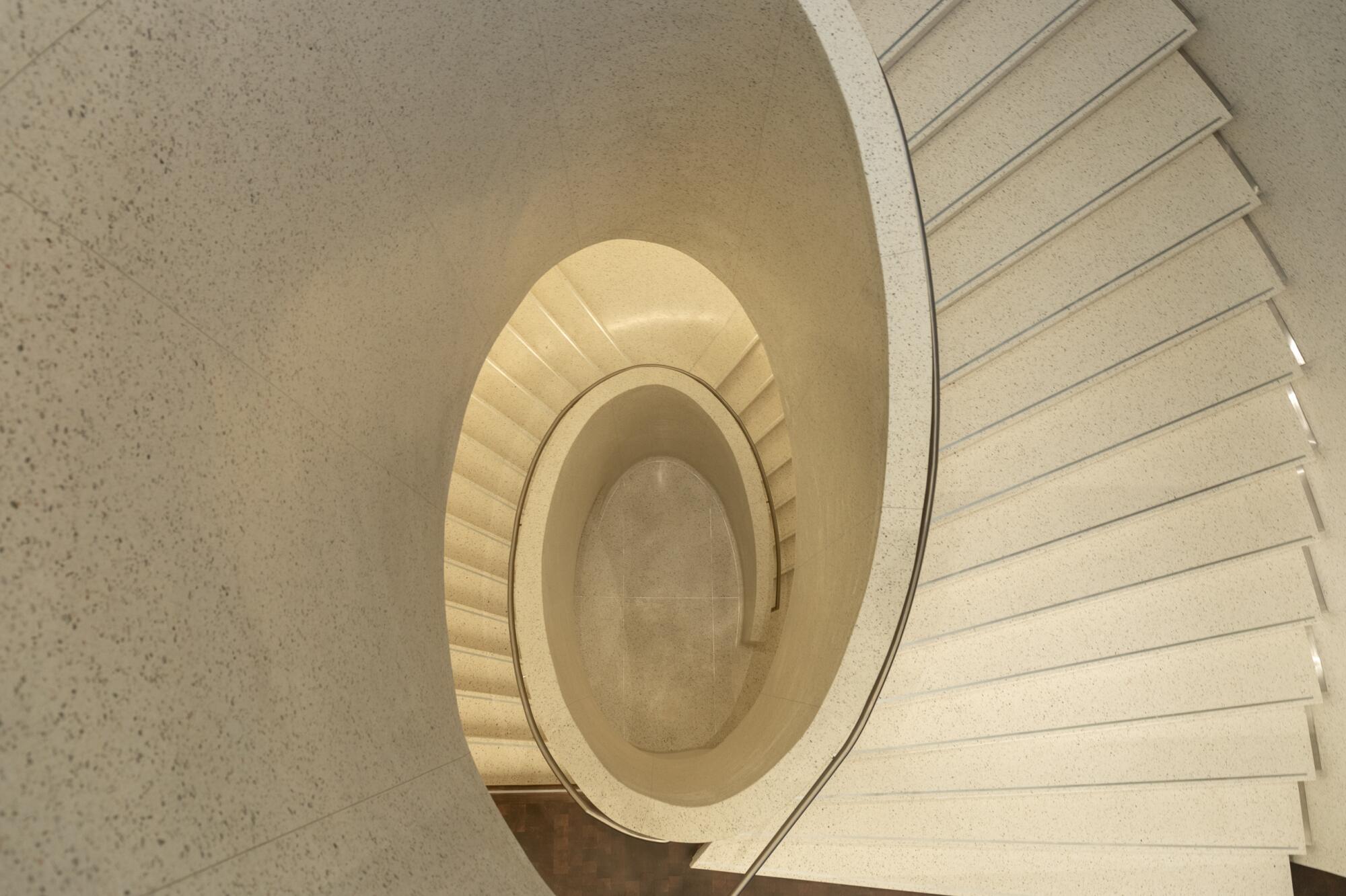
In the new welcome center, an elegant terrazzo staircase — forming an oval, of course — takes visitors from the ground floor to the event space on the second story. It is delightful and sensuous. Ponti would surely approve.
Open, airy Getty Villa expansion is restrained and refined but still embraces the present.
The renovation has resulted in countless upgrades. The most impressive detail, however, has nothing to do with the architecture and everything to do with programming: The Denver Art Museum has woven its educational spaces seamlessly into the galleries.
When kids arrive for a visit, they aren’t shunted off to some remote basement wing to learn about art. They occupy central spaces on each of the gallery floors. These are open — there are no glass walls — which means that anyone might wander in at any time to learn about forms and color and the evolution of Europe’s boundaries. It’s an architecture that makes no distinction between educational and curatorial space, and it is refreshing to see.
“Since the ’80s,” says museum deputy director and chief strategy officer Andrea Fulton, “education spaces have been integrated into gallery space.”
A MAK Center exhibition explores the Schindler House’s legacy as bohemian hot spot, Modernist icon, avant-garde residence and 100% L.A. story.
The Denver Art Museum’s Ponti-designed fortress is by no means a perfect building — or even a great building. It has variously been described as “Tower of London Modern” and “San Quentin of the Rockies.” Ponti could only mitigate the bulky floor plan so much.
But the museum is like no other, and Machado Silvetti’s deft moves bring out its best attributes. In fact, spend a little time with it, and you may just find yourself charmed. It’s like that eccentric uncle with the adventurous stories who lands at the dinner party in the houndstooth jacket, a jacket whose print is a little too bold and whose tailoring is off — but who wears it with such panache that by the end of the meal, you’re saying to yourself, Yeah, houndstooth!
So, yeah to Denver’s medieval art castle! And the many treasures it holds within.
"Gio Ponti: Designer of a Thousand Talents"
Where: Denver Art Museum, 100 W. 14th Ave. Pkwy., Denver, Colo.
When: On long-term view
Info: denverartmusem.org
More to Read
The biggest entertainment stories
Get our big stories about Hollywood, film, television, music, arts, culture and more right in your inbox as soon as they publish.
You may occasionally receive promotional content from the Los Angeles Times.
