Two Oscar nominations in the same category? Meet the designers behind ‘Beauty and the Beast’ and ‘Darkest Hour’
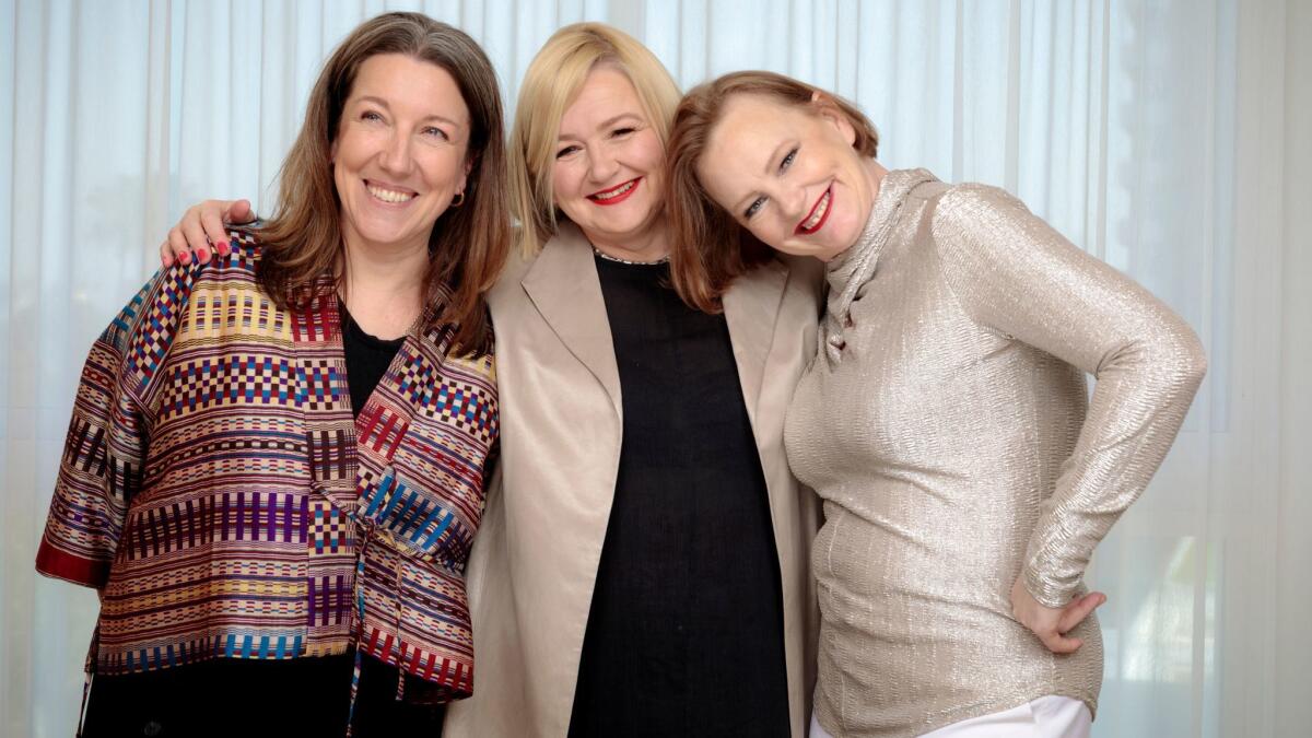
Reporting from London — It’s rare to see a double nominee in the craft categories at the Oscars, but this year there are three: costume designer Jacqueline Durran, production designer Sarah Greenwood and set decorator Katie Spencer. They have all earned the double honor for their work on two very different movies, “Darkest Hour” and “Beauty and the Beast.”
Durran is up twice for costume design, while Greenwood and Spencer are doubly nominated for production design. The connecting point is not the films, which couldn’t be more aesthetically distinct, but the three women themselves, who have developed an important working relationship over the past decade.
The trio first partnered with director Joe Wright on an adaptation of “Pride & Prejudice” in 2005 and have continued working with him since, including on “Atonement” and “Anna Karenina.” The director tapped all three to come onboard “Darkest Hour,” a moody interpretation of Winston Churchill’s rise to power during World War II.
“It’s a very kind of relaxed shorthand that’s built up between us,” Greenwood says, sitting with Spencer and Durran in the members club of the British Academy of Film and Television Arts in London a week before the BAFTA Film Awards, for which the trio are also twice nominated. “It’s not always intentional — we’re not always knowing that we’re going to work on the same films — but it’s something that’s grown. That’s what makes it really fun and exciting, and that’s come out of the films we’ve done with Joe and the way Joe works and his approach. We then, I think, have taken it to other films.”
None of the three had ever worked with Bill Condon, the director of “Beauty and the Beast,” Disney’s live-action version of the 1991 animated film. But when Condon hired Greenwood, Durran and Spencer soon followed, making six of the seven department heads on the film female.
The process of creating a reimagined “Beauty and the Beast” was long and arduous. The three met with Condon and producer Greg Yolen for a few hours every day for more than a month to go through the script word by word ahead of production.
“It was just to crash out things that were a bit loose and decide how to do things a bit better,” Greenwood says. “Like, ‘What can we do visually to tell the story better?’ That was a fantastic coming together on all levels. This is what we do with Joe all the time anyway. It’s almost like osmosis and because we’ve been at it for so long it works really well.”
“I think it’s really interesting with ‘Beauty and the Beast’ how the three of us connected on that more than any other project,” Spencer adds. “It goes through the characters — the clock, the candlestick, the teapot — which then goes through to the set, which comes to the props, which comes to the costumes. I don’t think it’s ever been so interconnected as that.”
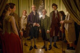
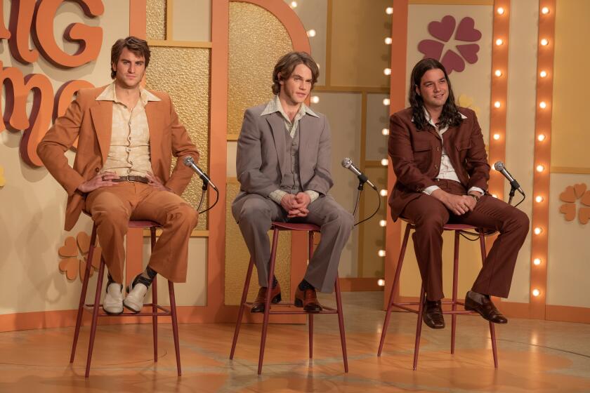
The team made a decision to set the film in France in the 18th century, looking to the original story as well as the 1964 Jean Cocteau film for inspiration. The sets were built from scratch on a soundstage in London and Durran’s challenge was to pay homage to the animation without making an exact replica of it.
“People want to see a recognizable Belle,” Durran says. “To play around too much with those components would potentially be a disappointment to the viewer. We knew that Belle had to have a yellow dress. She had to have a blue pinafore. So I had to have the animation, the historical period and everyone’s point of view in there.”
Greenwood and Spencer were able to take more liberties, particularly when it came to designing the castle interiors and the enchanted characters.
“Even though quite a few reviews said we were a slavish re-creation of the animation, it’s absolutely not true,” Greenwood notes. “If you take the thing scene by scene or moment by moment, the animation and the songs and the characters were fantastic. But with the look of it there was a lot of filling in the gaps. The candlestick — it’s got three heads and that’s it. That’s all you know. So when it came to doing all the characters, which was something Katie and I started on very early, it was about mixing what the historic artifacts were like, what were the characters like, who were the actors playing them, what did the costumes do. You had to think about the materials they were made out of that turned into their characters and how they turned into clothes.”
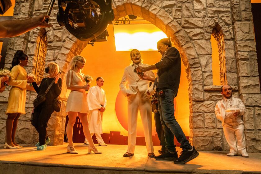
Surprisingly, “Darkest Hour” allowed for an even greater use of imagination in the production design and costumes. Durran felt a need to stay close to historical reality when designing Churchill’s clothing since he’s such an iconic figure, but otherwise the trio worked with Wright to create a unique interpretation of the period and mood. The budgets on “Darkest Hour” were significantly less than those on “Beauty and the Beast” (Greenwood notes that her specific budget on the Disney epic was likely more than the total budget for “Darkest Hour”). Greenwood and Spencer used empty, run-down buildings to create original sets for Buckingham Palace and Downing Street, both of which are neither exact replicas nor based on historical record. Instead, they wanted to infuse every scene with a worn-out pallor that matched the state of Britain at the time, which felt right for the film’s specific narrative tone.
“That was the feeling we especially brought into Buckingham Palace — the fact that it felt as tawdry as everything else did,” Greenwood says. “I’m not sure that it actually did, but in our film that was the feel we wanted to get across. The bulbs were on their lowest wattage, the walls weren’t painted. When Katie got all the furniture reupholstered instead of five-star bling we went for two-star and slightly muted. And that’s what Jacqueline brought to all the costumes. We all knew the level we were going for. It’s much more about an interpretation of the time and the period and the character and the way Joe shoots.”
“It was the same when building the War Rooms from scratch,” Spencer adds. “In the Nazi bunkers everything was immaculate. In the War Rooms here they’d literally say ‘Has anyone got any spare chairs at home? Have you got a map?’ The maps were sometimes out of date because that was a map that somebody had. It was extraordinary how ad hoc we were in winning the war.”
Durran was able to use the aesthetic of the sets to inform her costume design as well, which is something she often does when working with Greenwood and Spencer.
“It’s all about the atmosphere, so then I can interpret the environment and make decisions based on that interpretation about what people will be wearing rather than something more literal,” she says. “You want to make something for the people who live in that building. If I find a picture that I really think resonates with what I’m hoping to achieve in the film and I show it to Sarah and Katie then they can extrapolate from a costume what that would mean in the environment. And I can do the same back. So if Katie shows me a picture of a chipped, dirty skirting board then I try and indirectly reabsorb that into the costumes.”
One of the most striking moments of collaboration in the film is the pink dressing gown Churchill wears. There’s no historical record of his dressing gown being pink and all existing photos of him wearing it are in black and white. The historians Durran consulted with weren’t sure either, so the team had to take their own position on the dressing gown.
“In cooperation we talked about the color of the set and what Joe wanted to bring out in those scenes and how Gary [Oldman] wanted it to be, and we came to the conclusion that it was going to be pink,” Durran explains. “So then I had to find a fabric in the correct shade of pink, which we couldn’t find. We decided to have it woven and dyed, and we had slightly different shades of pink and couldn’t decide, so we made two different dressing gowns in two different shades of pink, and we chose one. Joe’s got the other one at home.”
“Pink is a really challenging color,” Greenwood adds. “Churchill referred to himself as a baby, which he does in the film, and a pig. So we painted the walls of his bedroom at Downing Street pink and Katie found this amazing crying baby sculpture. It’s subliminal, which is great. He’s quite fleshy. In the first scene when he hoists his legs out of bed he flashes Ms. Layton, it’s all a bit pink.”
“An important thing about Joe is that when we’ve created something between us he will then use it to the maximum,” Durran continues. “Other people may not have played on that fleshy pinkness, but he does. He wants to create the whole picture of what this fleshy color means in the room.”
When working on two vastly different films, it’s hard for the trio to determine which deserves the recognition of an Oscar.
“Personally you know which you think you did your hardest work for,” Spencer says. “But that doesn’t necessarily translate into which is the best film, especially when they’re so different. These two movies are so opposite and that’s lovely.”
“Both of them are deeply lovely and deeply flawed,” Greenwood adds, “and neither do I love more than the other.”
More to Read
Only good movies
Get the Indie Focus newsletter, Mark Olsen's weekly guide to the world of cinema.
You may occasionally receive promotional content from the Los Angeles Times.
