Photos: California Midcentury meets Latin American modern
By Lisa Boone
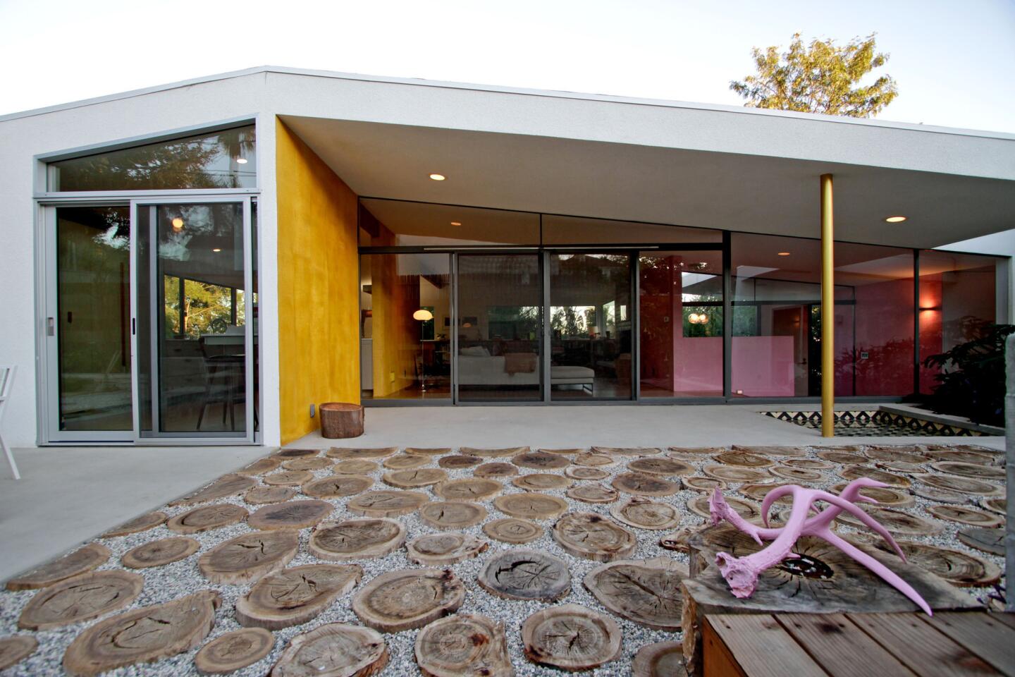
Filmmaker and KCET producer Juan Devis and artist Laura Purdy worked with architects Linda Taalman, Alan Koch and Rebecca Rudolph to update their 2,000-square-foot home, shown here from the back. The goal wasn’t to add space but, rather, to make the space more practical and personal. Behind the house, the patio was extended to provide more outdoor living space, and wood rounds cut from a diseased eucalyptus tree were set in gravel. (Ricardo DeAratanha / Los Angeles Times)
Taalman Koch Architecture guides a Los Feliz couple through a remodel that preserves the house’s Midcentury lines but infuses the spaces with warmth, emotion and personal connections. The vision: California Midcentury meets Latin American modern.
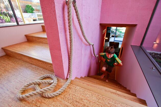
The view from the entrance of the house: Simon Devis, 5, walks up stairs from the “children’s wing.” To the left are stairs to the main living areas. (Ricardo DeAratanha / Los Angeles Times)
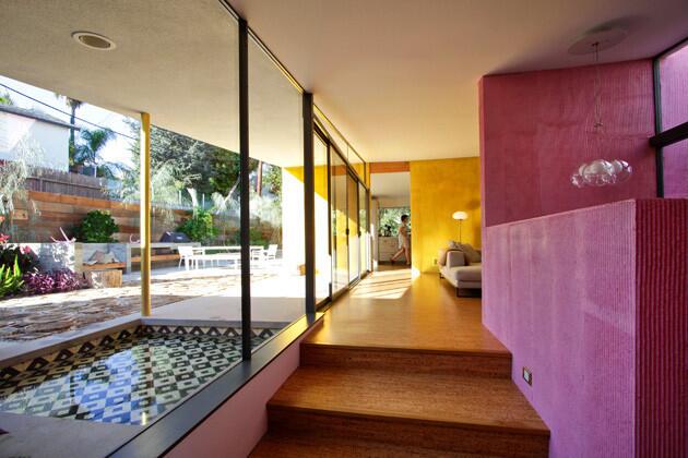
The entry hallway opens to floor-to-ceiling windows and raked stucco walls glowing in saturated pink and saffron, a nod to Mexican Modernist architect Luis Barragán. A pint-sized wading pool, tiled in graphic black and white, punctuates the view outside. (Ricardo DeAratanha / Los Angeles Times)
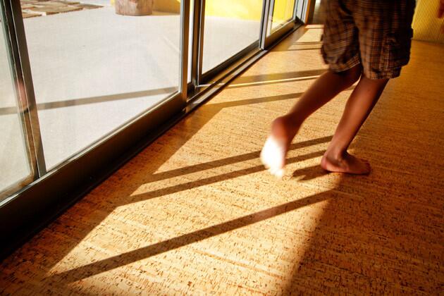
Architects also used the palette of materials to give the house a 21st century update, including cork flooring that replaced wood, tile and carpeting. (Ricardo DeAratanha / Los Angeles Times)
Advertisement
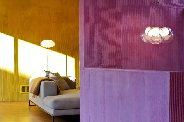
Despite its new raked walls and color palette, the home stays true to its Modernist origins. It’s filled with natural light, maintains an open floor plan and effortlessly integrates indoors and out. (Ricardo DeAratanha / Los Angeles Times)
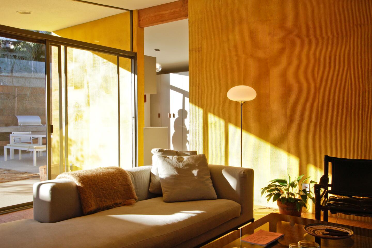
Play of light in the living area. (Ricardo DeAratanha / Los Angeles Times)
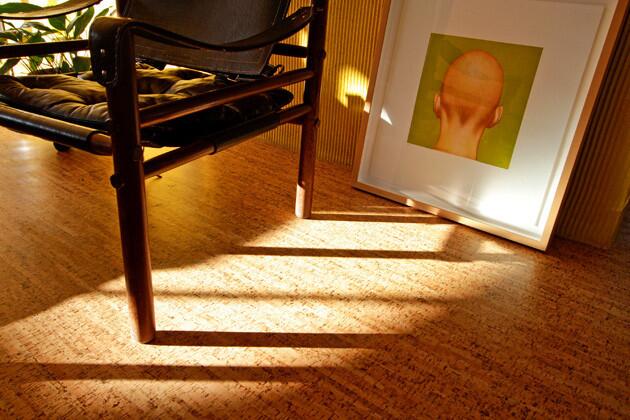
Detail of cork floor and “Untitled (Head With Chartreuse Background)” 2001 by Salomón Huerta. (Ricardo DeAratanha / Los Angeles Times)
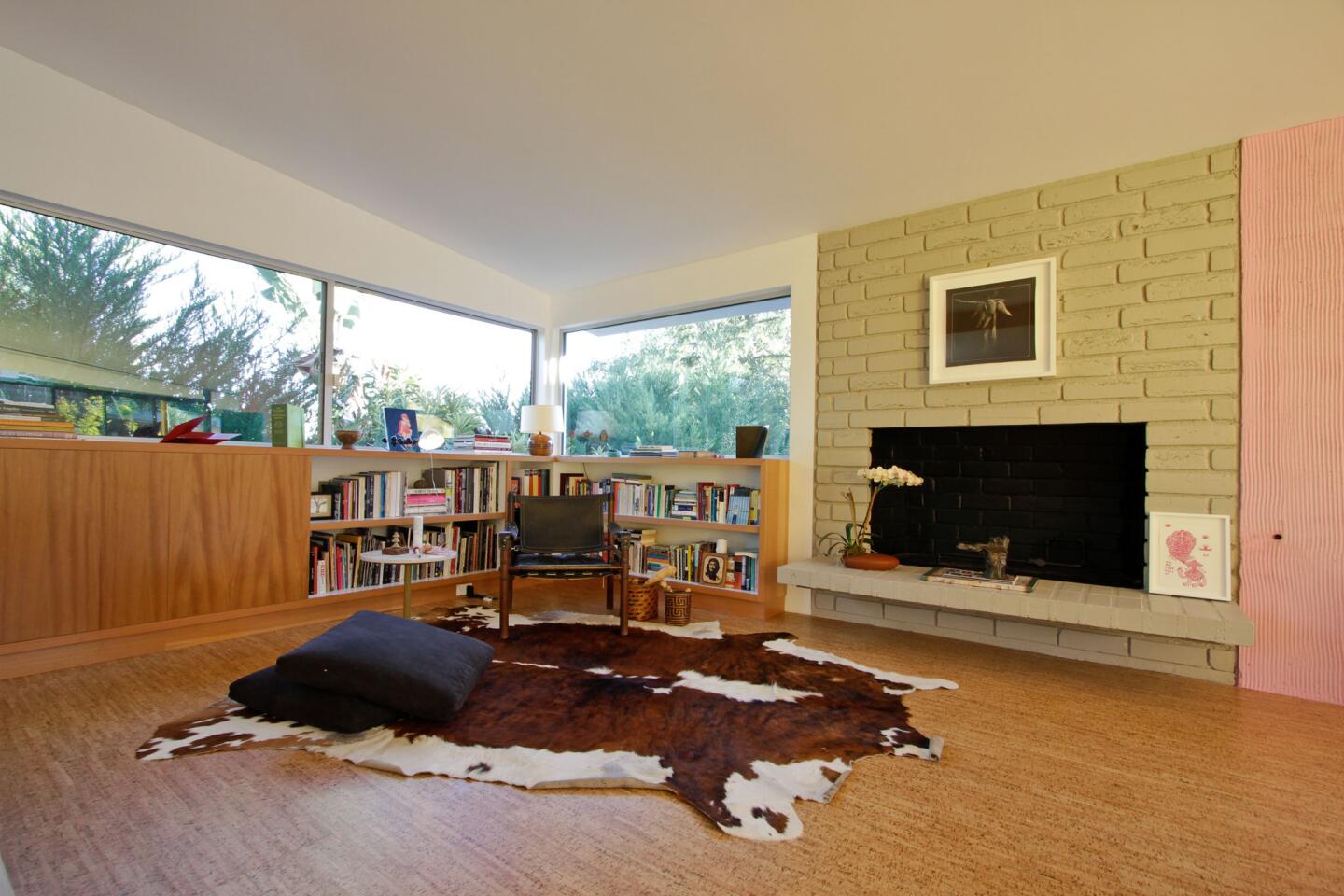
Wider view of the living room. The home’s original fireplace was refurbished. (Ricardo DeAratanha / Los Angeles Times)
Advertisement
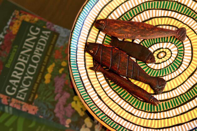
Norwegian wooden fish set atop a Brazilian plate. (Ricardo DeAratanha / Los Angeles Times)
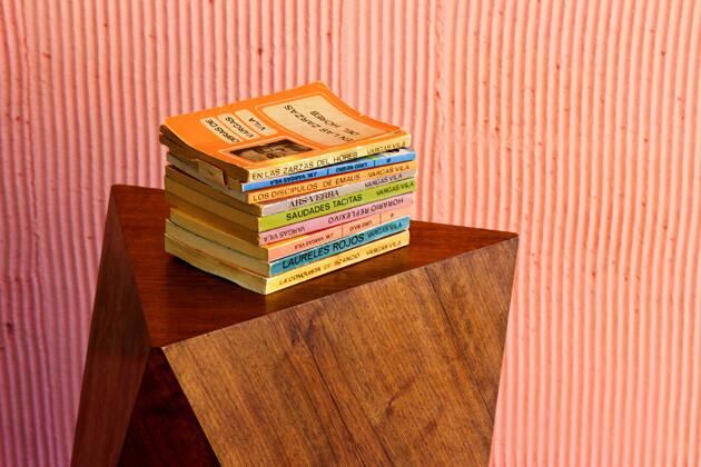
Smooth against the rough. (Ricardo DeAratanha / Los Angeles Times)
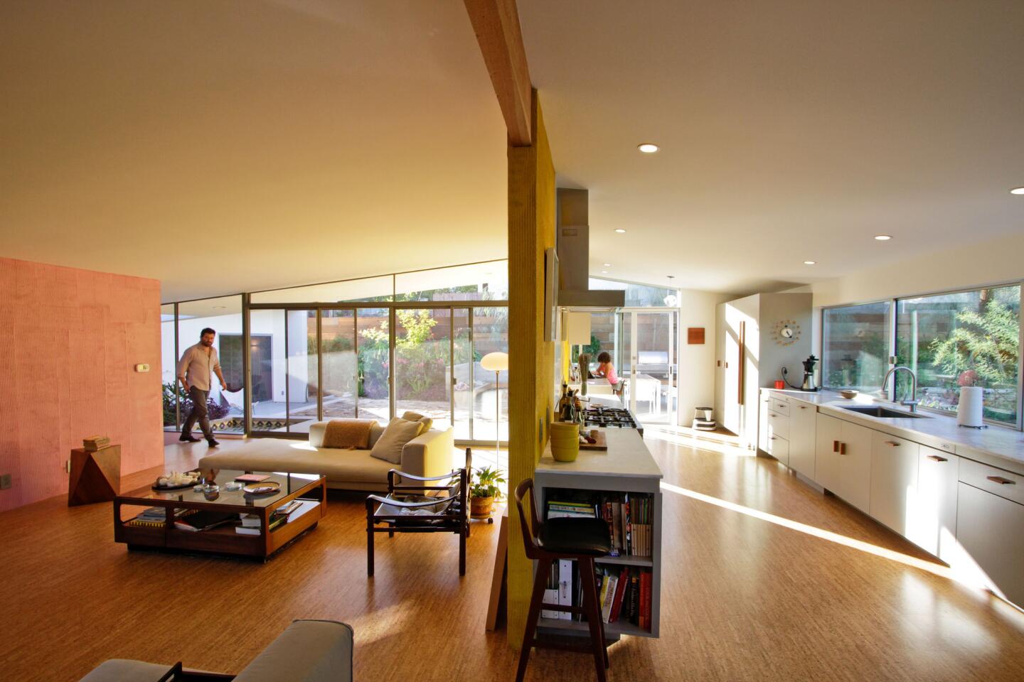
Walls and door headers were removed to create the open plan upstairs, with the living room on the left and the kitchen on the right. Note the cabinetry toward the back wall, formerly the laundry area. A wall between the kitchen and dining room was removed to open up the space. (Ricardo DeAratanha / Los Angeles Times)
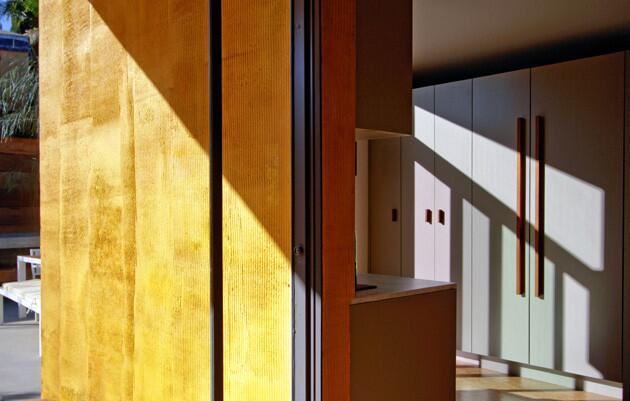
The hand pulls on cabinetry throughout the house are custom pieces that the architects designed from teak. (Ricardo DeAratanha / Los Angeles Times)
Advertisement
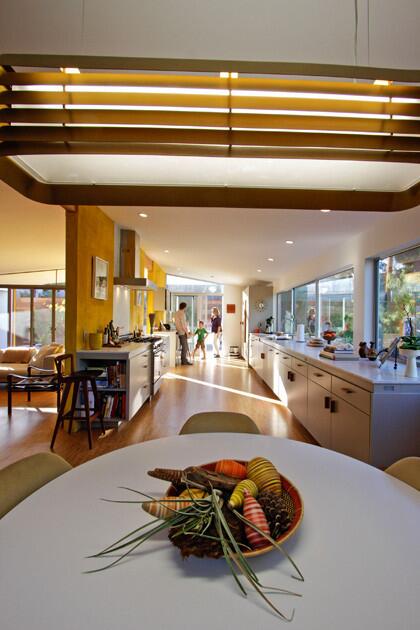
The kitchen, as seen from the dining area, and … (Ricardo DeAratanha / Los Angeles Times)
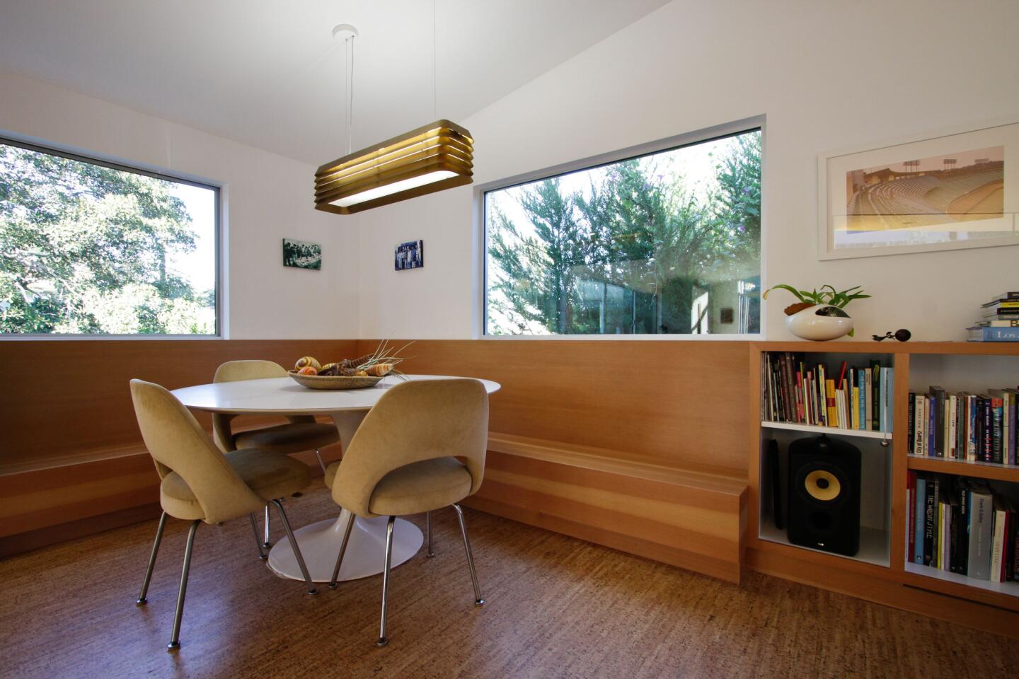
The banquette in the dining area transitions into living room bookcases. (Ricardo DeAratanha / Los Angeles Times)
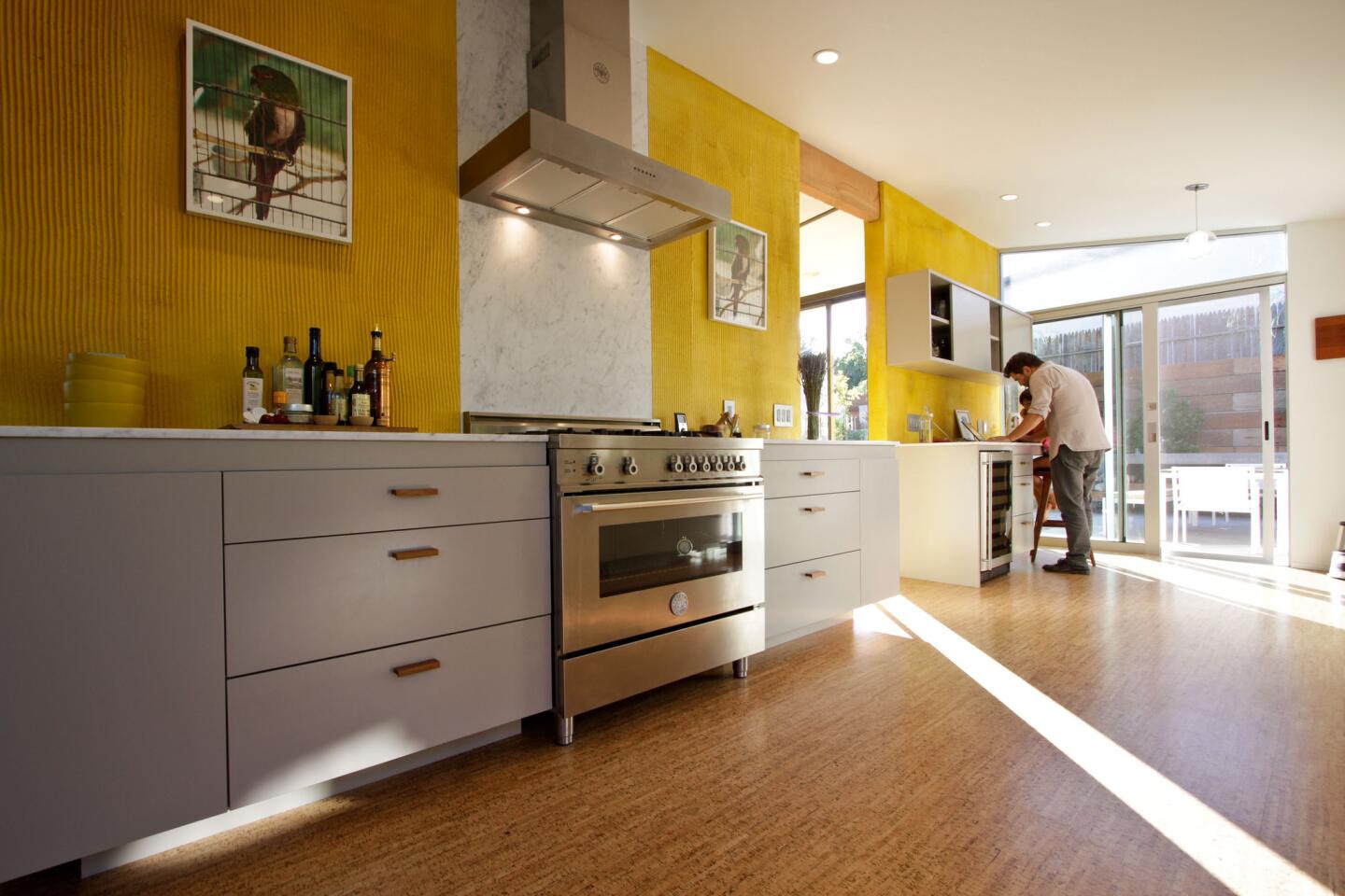
Light streams through an opening in the kitchen wall. Architects removed upper cabinets and made the walls textured stucco, a backdrop for couple’s art, which is often political and confrontational. The Chilean parrots here are artist Cristian Silva’s statement about dictator Augusto Pinochet. The custom cabinets are painted in Benjamin Moore’s Silver Fox hue and are paired with smooth Carrara marble countertops. The range is Bertazzoni. A door to the outside was added for better access to the patio dining area. (Ricardo DeAratanha / Los Angeles Times)
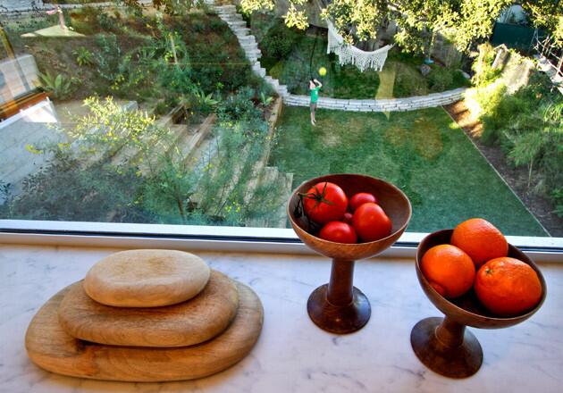
The view from the kitchen, looking down into the lower part of the backyard. Windows in the kitchen were enlarged to offer better views. (Ricardo DeAratanha / Los Angeles Times)
Advertisement
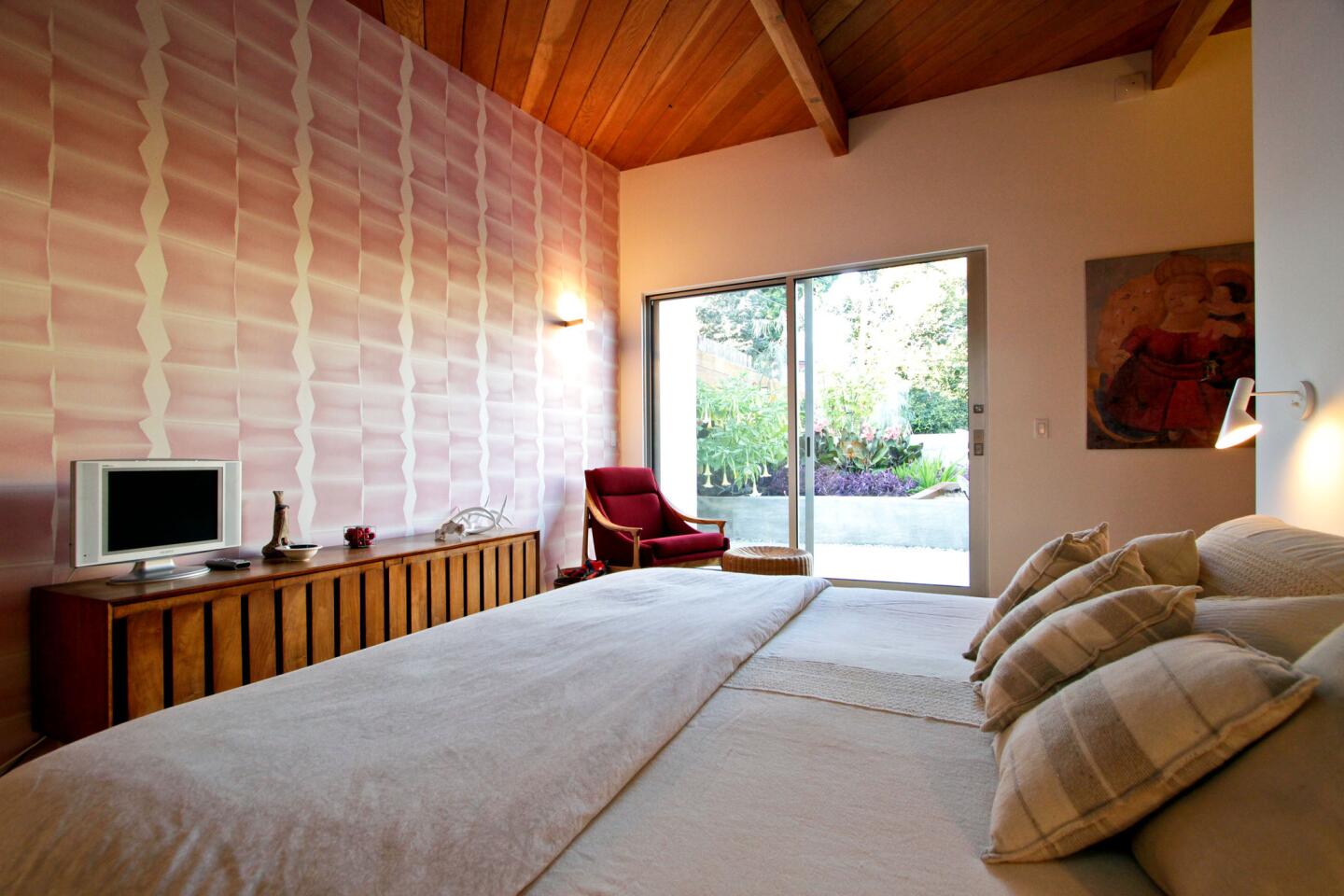
Before the remodel, the upper floor had three bedrooms and a bath, all set in a row. The architects reconfigured the space as a master bedroom with walk-in closet and larger bathroom, plus an office/guest room. Here in the master, Step wallpaper from Walnut adds some graphic punch. Doors lead to a new patio. (Ricardo DeAratanha / Los Angeles Times)
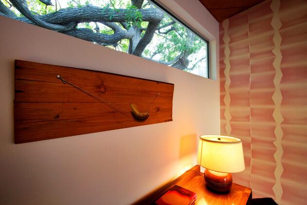
A new clerestory window lets in more natural light and frames a view of the green canopy outside. The painting is by homeowner Juan Devis’ father, Colombian artist Fernando Devis. (Ricardo DeAratanha / Los Angeles Times)
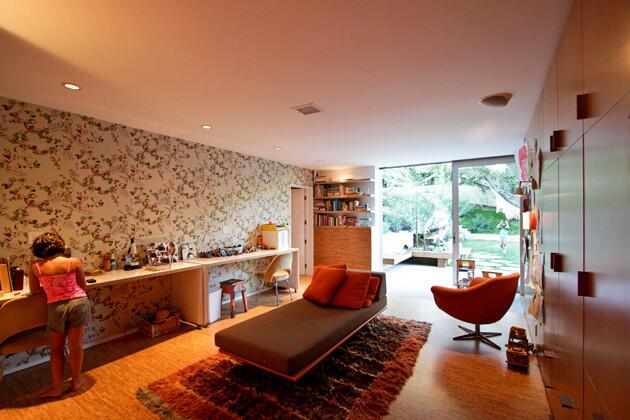
Architects moved the children’s bedrooms downstairs to what had been a small, dark office and playroom. The newly created “children’s wing” is composed of two small bedrooms, a connecting bath and a large area for play and work, pictured here, with cork bulletin boards for art. Eva Luna Devis, 8, stands by one of two custom desks on castors. The wall adds a graphic punch with the Daks design from Walnut Wallpaper. (Ricardo DeAratanha / Los Angeles Times)
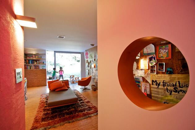
The playroom. (Ricardo DeAratanha / Los Angeles Times)
Advertisement
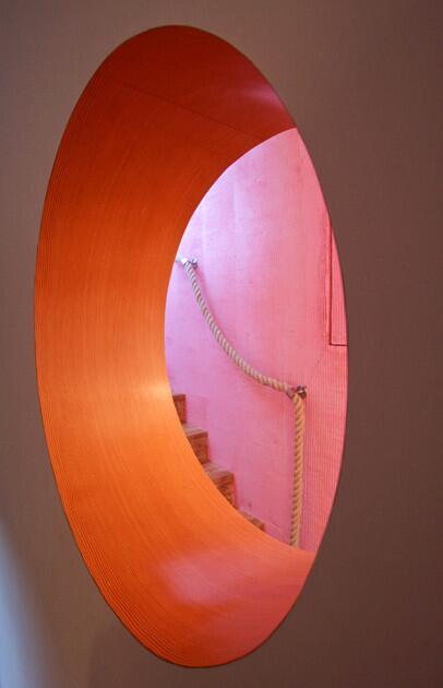
A cutout in the playroom wall. Part of the warm pink glow in the room is reflected light carried down the stairs. “It’s like a James Turrell light sculpture,” Purdy said. (Ricardo DeAratanha / Los Angeles Times)
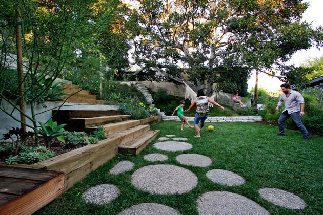
Juan Devis, right, and housekeeper Delmy Morales play soccer with Simon while Eva sits on a swing. The family turned to artist Laura Cooper for help creating a landscape that not only melded with the house but also was “wild and chaotic, yet soft and romantic,” Purdy said. To help connect the upper and lower levels of the gardens, Cooper designed an 8-foot-wide staircase that helps to shape what they call an amphitheater. “Stairs are social spaces if you make them wide enough,” Cooper said. The concrete patio rounds and the concrete wall in the foreground were made from the home’s old patio. (Ricardo DeAratanha / Los Angeles Times)
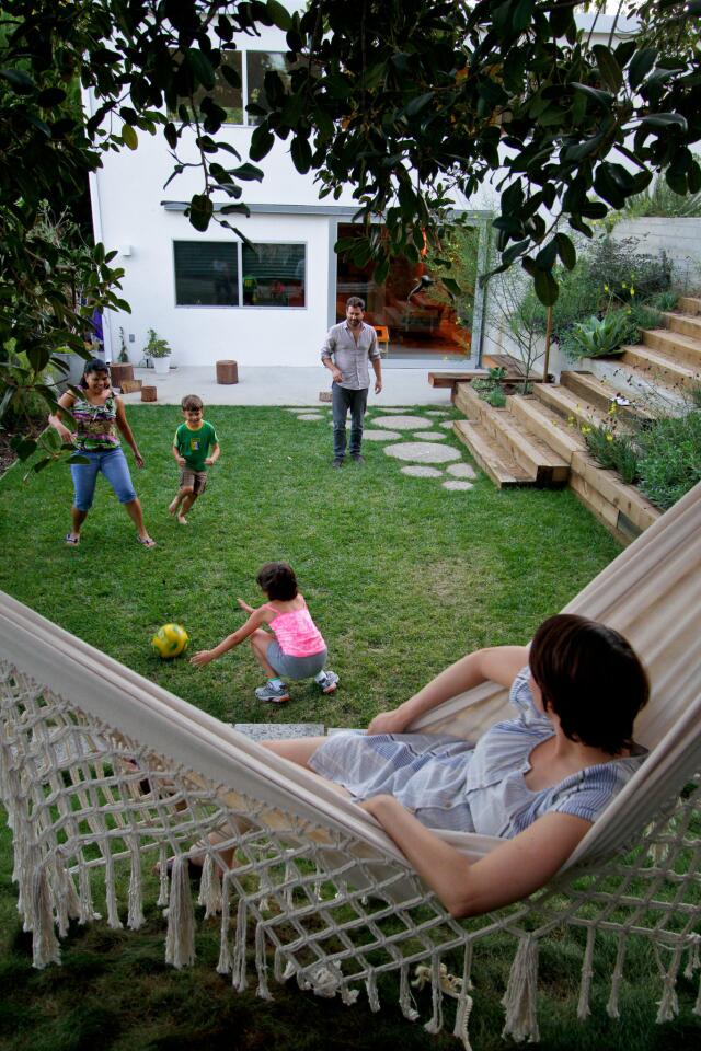
Soccer in the late afternoon. (Ricardo DeAratanha / Los Angeles Times)
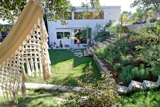
The reverse view, looking back toward the house. (Ricardo DeAratanha / Los Angeles Times)
Advertisement
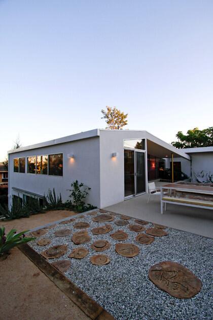
Free-form shapes play off the clean, straight, Midcentury lines. (Ricardo DeAratanha / Los Angeles Times)

Freeform shapes play off the clean, straight, midcentury lines. (Ricardo DeAratanha / Los Angeles Times)
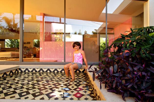
Eva dips her feet into the wading pool. After nine months of undergoing remodeling, the home feels like a family oasis while retaining its Modernist grace, something that hasn’t faded since 1952. Purdy agrees: “We didn’t want it to feel precious. When people come over, they say, ‘It’s still the same house.’ ”
More profiles: California homes in pictures
L.A. scene: Home and garden news and reviews (Ricardo DeAratanha / Los Angeles Times)


