Editorial: Bring buttons and dials back to new cars. Touch screens distract drivers
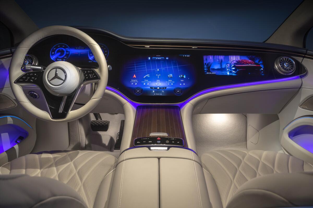
As cars go electric and get more technologically advanced, their interiors are increasingly being built around prominent dashboard touch screens.
Nearly every automaker has been moving controls for windshield wipers, headlights, air conditioning, gear selection and other basic functions to these centralized touch screens. It’s an industrywide shift that is most pronounced with electric vehicles but not limited to them. Consumers have rightly complained that screens are more of a pain to use than the intuitive physical buttons, dials and switches cars have been equipped with for decades.
But the trend is not just an issue of consumer preference or convenience. It’s a matter of safety, because the time drivers spend tapping through sleek but hard-to-navigate touch screen menus is time they are taking their eyes off the road.
The Biden administration watered down rules to boost electric vehicles for political reasons. We should be speeding to cut planet-heating pollution.
So it’s welcome news that an influential auto safety certification body in Europe is working on new standards that would push against car companies’ overreliance on distracting touch screens.
Under new standards the European New Car Assessment Program plans to introduce in 2026, automakers will have to use separate physical buttons, dials or levers for critical functions such as turn signals, hazard lights, horns, windshield wipers and emergency calls in order to earn the independent organization’s top five-star safety rating.
It’s about time. Because the touch screen domination of new car interiors has already gone too far. Tesla and other manufacturers devote much of their dashboard space to huge, center-mounted screens as big as 18.5 inches. The Ford Expedition has an available 15.5-inch screen that replaces an array of audio and climate dials and buttons with touch controls. The Mercedes-Benz EQS features a full-dash “Hyperscreen” that spans nearly the entire width of the vehicle’s interior and controls almost everything, from navigation and temperature to entertainment. These screens certainly add to these vehicles’ sleek aesthetics, and the manufacturers no doubt save money by moving those functions into one central touch screen.
But not everyone sees it as progress. Customer complaints have forced some carmakers, including Volkswagen, to bring back some of the manual buttons. Third-party companies are seeing a ripe market for aftermarket buttons and dials to mount below Teslas’ touch screens. And electric-vehicle startup Olympian Motors is offering new models with retro, minimalistic interiors with numbered dials to cater to customers sick of screens.
Big Oil wants you to think that California’s high gas prices are because of state climate policies. But the oil industry is actually responsible for much of it.
The backlash is understandable. The screenification has gone too far when you can’t even change windshield wiper speeds, turn on headlights or put the car into park or drive without navigating a touch screen. In the name of driver distraction and safety, there are some functions so critical to safe operation that they should remain physical and easy to access without screens.
The standards the Euro NCAP safety ratings body is developing, while voluntary, “will encourage manufacturers to use separate physical controls for basic functions in an intuitive manner, limiting eyes off road time and therefore, promoting safer driving,” an official with the organization told the United Kingdom’s Sunday Times recently.
The U.S. must use whatever clout it retains in the region to end the madness that has pushed the Palestinian people in Gaza to the brink of famine.
We’d like to see U.S. authorities follow suit and adopt their own standards to ensure that safety-critical functions in all new cars have physical controls in intuitive locations. When you’re in imminent danger you want hitting the horn, hazards or wipers to be easy and reflexive — not a task that requires you to take your hands off the wheel and tap through an in-car app.
Safety authorities should be concerned that the prominence of touch screens to control functions inside of vehicles is dangerous. According to the National Highway Traffic Safety Administration, driver distraction resulted in at least 3,000 known deaths in 2019, the most recent year for which figures are available. NHTSA is making significant updates to its five-star safety ratings program that could include measures to address driver distraction from controls and displays inside vehicles.
These ratings are designed to push the auto industry beyond the minimum federal requirements by informing consumers about how safe new vehicles are. It is clear that drivers’ interaction with dashboard technology is a fast-growing part of that equation, and it’s only fitting that these metrics change with the times. In years past, concerns about distracted driving focused mostly on texting, but that has been overshadowed by the rapid shift to massive in-vehicle infotainment panels that compete with the road for drivers’ attention.
Drivers have enough to worry about on the roads. They shouldn’t have to spend any time thinking about how to control their cars’ most basic functions.
More to Read
A cure for the common opinion
Get thought-provoking perspectives with our weekly newsletter.
You may occasionally receive promotional content from the Los Angeles Times.
