ART REVIEW : The Library’s Most Valuable Additions : Some artworks commissioned for the new Bradley Wing help to mitigate the building’s architecturally disappointing design.
The completion of the new Tom Bradley Wing of the Central Library, which opened Sundayafter $214 million spent during a decade of planning and construction, marks the second momentous public building in Los Angeles to have been designed by the firm of Hardy Holzman Pfeiffer Associates (HHPA), under the guidance of principal architect Norman Pfeiffer. Like the Anderson Building at the L.A. County Museum of Art, which was also eagerly anticipated before its 1986 debut, the library expansion turns out to be a major architectural disappointment.
Thankfully, some of the public art commissioned for the project partially mitigates the fiasco.
As at LACMA, the 360,000-square-foot Bradley Wing is a graceless, overwrought hulk that lays no compelling claim on the civic imagination. The necessary functional ingredients for a library are in place, but their design says little about what our metropolitan aspirations might be today.
The failing is heightened by the incomparable significance of the original 1926 building, designed by Bertram Grosvenor Goodhue and since ravaged by fires, earthquakes and the passage of time. Arguably L.A.’s first great public space, some would say it’s still the champ.
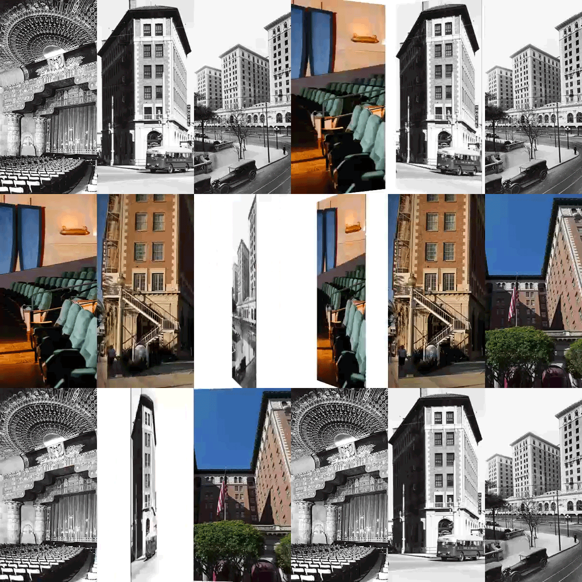
Happily, a superb clean-up of Goodhue’s masterpiece has been lovingly accomplished. HHPA has a well-deserved reputation for admirable restoration of existing buildings. Except for some lamentable rotunda benches, which look like a nursery playpen (and are easily removed), the results of the Goodhue project are magnificent.
From the “lamp of learning” torch at the peak of the building’s famous pyramid, newly cast from the damaged original, to the densely ornamented, cruciform rotunda at the physical and spiritual heart of Goodhue’s design, nothing seems to have been overlooked. The original Central Library is back.
So, in a way, is the west entrance lawn, which was bulldozed for a parking lot nearly 25 years ago. Landscape architect Lawrence Halprin, working with artists Jud Fine, Laddie John Dill and Mineo Mizuno, has recalled the original series of three stepped walkways and reflecting pools, lined with cypress, that once led from Flower Street to the entrance.
The imagery in this new garden derives from the site’s natural and social history, a conventional idea in public art. Small animal sculptures within the pools, as well as multilingual glyphs and pictographs adorning stairs and basins, suggest a garden archeology.
Natural and political science meet in an undulating lawn and a north-south path that crosses the linear promenade. A small, rather ugly fountain to the north stacks pie-shaped plinths atop a shifting, striated floor, implying a geological source for its bubbling water. A big, rather odd fountain to the south is an architectural-style grotto chiseled with words from the Constitution’s 14th Amendment, which mandates due process and equal protection of the law.
The garden’s gently tiered stairs are echoed--gigantically--at the east end by the huge atrium of the Bradley Wing, which descends down three escalators from the Goodhue building. A Postmodern riff on Egyptian Deco columns, clad in the same green tile used to such poor effect at LACMA, line the eight-story space. Atop the columns, steel trusses support a glass roof.
The atrium glass brings natural light into several subterranean library floors. Noble cause, odd result: The grandiose escalator-promenade arrives at an underground dead end, while a three-story window above lets light pour in as you look out on a brick wall across the street.
That icon of postwar suburban design--a decorated shed--is here offered as civic symbol. Machine-image Modernism is gussied up with pastiches plucked from Goodhue’s building. Deco doodads are scattered about in furnishings, while the pink, blue, green and yellow steel trusses borrow the pastel palette of the 1933 murals in the Goodhue rotunda.
The civic symbol is empty, though, because the aim of the decoration is purely formal: to visually tie the new wing to the old. Two of the artists commissioned to work on the new wing attempt the same goal.
Outside, Ries Niemi has fashioned benignly pretty metal grills along Fifth Street. They employ Deco designs and literary aphorisms in several languages, recalling those in English and Latin that Goodhue had chiseled into his building’s walls.
Inside, Therman Statom has attached painted-fiberglass symbols of nature, technology and metaphysics to three immense, atrium chandeliers. Obliquely recalling the delicate zodiac chandelier in the Goodhue rotunda, their playfulness weighs a ton.
Recycling old motifs into new ones lends a whiff of Postmodern stylishness. But Goodhue’s design wasn’t just a formal exercise. His clear, resonant, powerfully spoken imagery makes the garrulous addition look like a chattering nabob.
In a small relief at the lower Hope Street entrance, Goodhue depicted himself as a studious monk. The New England architect’s cruciform rotunda declares the building to be a secular cathedral for civic worship of accumulated knowledge. A centered, crystalline form whose geometry is reinforced by densely patterned stenciling, the rotunda encloses the zodiac chandelier. Its earthly globe is at the metaphoric center of a rigorously ordered universe.
The surrounding 1933 murals of early California by Dean Cornwell refine the theme. In storybook hues, they portray the subjugation of an indigenous population by Spanish missionaries as a wholesome, “civilizing” activity: Harmonious forces of church and state do their colonial work, and all is shown to be right with the world.
Goodhue’s library and its murals didn’t deserve careful restoration because of any faith in obnoxious claims like these, but for the brilliant aesthetic clarity with which they convey a historical presumption on which modern Los Angeles was built. For the new wing, merely scavenging from these motifs to decorate the status quo was a pitiable artistic decision.
Three of the artists commissioned for the expansion project attempt to gently undermine the vulgar historical conceit. Although it’s hard for art to compete with so massive an architectural program, their work stands out.
On the ceiling of a small rotunda housing the main information desk, Renee Petropolous has painted a decorative tour de force of orbiting interlaces in which nothing is centered. Or, rather, multiple centers happily coexist. Homage is deftly paid to Goodhue and Cornwell’s artistic skill, while their ideological scheme is simultaneously exploded.
David Bunn undoes the scheme by making a wry joke of a library’s image as the center of universal knowledge. Two elevator cabs are lined with a Modernist grid of old catalogue cards for books beginning with the words complete or comprehensive, as in “The Complete Book of Hair” or “A Comprehensive Guide to Weaponry.” The defunct cards show a library to be a living ruin, always incomplete and never comprehensive.
Finally, Ann Preston’s wonderfully hybrid torchiers march like tall sentinels down the atrium. Both machined and organic, phallic and feminine, reminiscent of plants and of people, these “lamps of learning” exist betwixt and between known images, inhabiting a new and mysterious identity.
Ideally, HHPA’s design also would have offered a new and progressive civic image for our conflicted time. Instead, it’s a sore disappointment.
More to Read
The biggest entertainment stories
Get our big stories about Hollywood, film, television, music, arts, culture and more right in your inbox as soon as they publish.
You may occasionally receive promotional content from the Los Angeles Times.


